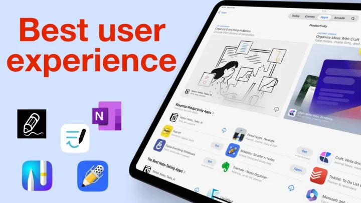
Notability is a handwriting note-taking app for the iPad, iPhone, and Mac. It costs $2.99/month or $14.99/year for all your devices. You get a discount for your first year at $11.99, which renews at the normal price. We’re still waiting for the app to support family sharing for its subscription. We have always questioned if the Notability subscription is worth it, and after its latest app upgrade, we’re now convinced that it’s not. That is why we recommend the following alternatives if you’re looking for an affordable handwriting note-taking app:
- Noteful: $4.99 (Editor’s choice)
- Nebo: $7.99 (Editor’s choice for handwriting-to-text conversion)
- Noteshelf: $9.99
- ZoomNotes: $7.99
- Microsoft OneNote: free
- Samsung Notes: free (on Samsung only)
- Apple Notes: free
Notability has a free trial, so you can try it before signing up for the subscription. This review focuses on the subscription version of the app for the iPad.
Creating new notes in Notability
Since the Notability 14 update, a lot has changed in the app. Creating new notebooks in Notability has become a little confusing. The app still has many page templates with plenty of colour and size options, though. The basic templates in the app even have line-spacing options, which is rare to find in a handwriting note-taking app. You can also choose to use landscape or portrait page templates.
The gallery, which is now more accessible than before, has more templates shared by other Notability users from around the world. If you’re still not happy with all those, you can simply add your own templates to the app’s library. Unfortunately, that is still limited to one page per template. So, to use our digital notebooks, we have to import them into the app as PDFs.
When using the app’s basic templates, you can quickly change the page template for a new notebook if you don’t like the one you’re using. For example, if you create a squared notebook, you can quickly switch to a dotted one without having to go back to the homepage. The options at the bottom of your screen also allow you to import PDFs and add scans to your new notebook. We haven’t found that useful, and at first, it’s probably just confusing.
User interface
The user interface in Notability has always been clean, minimalist, and modern. But somehow, the developers managed to make it even more minimalist with a shorter, floating toolbar that you can put on any side of your iPad screen. You can also choose what tools go on the toolbar now, allowing you to add only the tools you need. It works great for minimalist note-takers. The toolbar grows as you add more tools to it, but it still has its limit, which is a pain, especially when you want to save some favourite tools. The floating toolbar creates the illusion that your notebook is an infinite canvas. Overall, the user interface looks great, and the customisable toolbar improves the user experience in the app. However, Notability still needs to work on some of its icons that are not intuitive for digital note-taking.
Pen tool
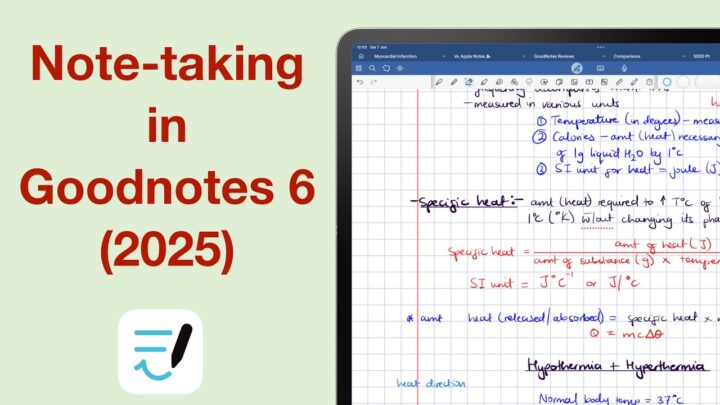
Notability has two types of pen tools: ballpoint and fountain pens. The dashed and dotted pens are not great for handwritten notes, but they are cool for drawing diagrams or decorating your notes. You also have a pencil tool, which is awesome. Both tools have a decent range of fixed pen thicknesses, but the toolbar can now only accommodate a maximum of three at a time. Using a lot of pen thicknesses is now difficult because you have to keep adjusting the three on the toolbar. The app still has a lot of default colours, and you can add custom ones using the hex code, slider, or colour picker. Notability 14 has made it easier to access custom colours on the toolbar. Eight colours are probably enough for most note-taking needs.
Highlighter tool
The highlighter in Notability goes behind your ink. So, it does not dim your notes when layered. It has the same options as those for your pen tool. We love that your pen, pencil, and highlighter tools all have different colour palettes. The colours you use for your pen are not the ones you’d typically use for a highlighter. So, we love that the developers have made that differentiation.
Eraser tool
The eraser tool erases per stroke and pixel. It also has twelve fixed sizes, which is overkill. However, too many options are better than too few. You can selectively erase only the highlighter. Since an eraser has no colour options, it’s easier to access its different sizes and types on the new toolbar. The eraser is now much easier to work with in Notability than most of its other tools. For a handwriting note-taking app, an eraser is useful. I use the undo icon more, though. I dislike that they moved it to the other side of the screen, and now I have to relearn to use it.
Handwriting experience
While it’s very easy to quickly change your pen colour when writing notes in Notability 14, it is very difficult if you use a lot of different pen thicknesses and types. Assuming that you have eight colours (the maximum you can have on the toolbar), you will need to scroll back and forth to access your pen thicknesses and pen types. This slows you down, especially if you need to keep up with a lecturer or presenter.
The developers should consider bringing back a separate favourites toolbar where we can save our frequently used tools for faster and easier access. Combining the main and favourites toolbars into one hasn’t really worked well in Notability. Perhaps they can make the toolbar longer, like what you get in Noteful (my go-to note-taking app). The fewer steps there are to get to our tools in a note-taking app, the better.
Zoom tool
The customisable toolbar has made the zoom tool easier to access; it’s much better than the setup they had when they first released Notability 14. The tool still has a decent zoom range and supports auto-advance. It no longer has our writing tools, though, so we have to use the main toolbar for that. Notability 14’s minimalism is counterproductive. The zoom window itself looks terrible and is hard on the eyes. I am always trying to see where the zoom window starts and where the notebook page ends. It’s an unpleasant experience, definitely the worst feature in Notability 14. It is practically unusable!
Adding items to your notes
Who came up with the idea of replacing the plus icon with a photo one? Notability’s new user interface is just confusing. Under this confusing new icon, the app groups all the items you can add to your notes: photos, stickers, GIFs, and sticky notes. They pop up on the right side of the iPad screen, not under the icons (another confusing setup). It is difficult to use for right- and left-handed people. Why can’t it pop up in the middle, right below the icon?
Body text and text boxes
Body text, which goes directly on the page, no longer aligns with your basic template lines. The developers have ruined a lot of the app’s best features. Your text options are the same for your body text and text boxes. The keyboard toolbar is the first feature that Notability has perfected in version 14. It looks modern, is compact, and has all the essentials for text formatting in a handwriting note-taking app. We have lost the ability to customise it, though. But you probably won’t lose any sleep over that.
You can add different types of text presets: headings, paragraphs, and captions. We can also still add unnumbered, numbered, or interactive checklists to our notes. Notability supports three bullet point and numbering types for creating hierarchies in your lists, which is great. Interactive checklists are still amazing in Notability. In that, the app strikes out and dims them as you check items off your checklists. We simply love checklists in Notability because incomplete tasks are easy to differentiate from complete ones.
You can use custom fonts. The developers have since resolved the issue that made them [custom fonts] difficult to use when they first launched Notability 14. For all your text, you can resize it, change its colour, and format it to make it bold, italic, or underlined. The app can still save three favourite text styles, but we can’t edit them anymore. Instead, we have to delete saved styles and create new ones, which is too much work if you just want to change a single feature.
Text alignment is still limited to your text boxes. Line spacing is now easier to appreciate, even with body text. Text boxes mix better with handwritten notes than body text. They make more sense in a handwriting note-taking app than body text. Text boxes can have a transparent background, a solid colour, or a paper template. Text seems to align better with paper template line spacing in text boxes than with body text. It leads us to believe that the discrepancy is probably just a bug that will be resolved soon.
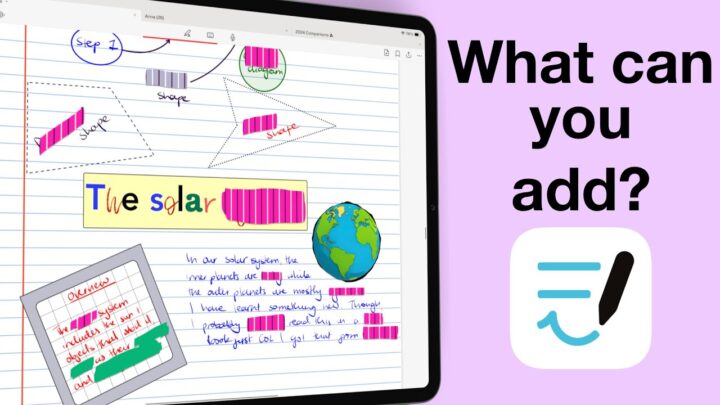
Shapes
You can draw regular and irregular shapes in Notability, as well as curved lines and arrows, using the pen, pencil, or highlighter tools. We love that the app now has open arrows and that the arrowheads are now a decent size. Notability can adjust your shapes after you’ve drawn them to change how they look, their border type, thickness, colour, and fill. We’re still waiting for opacity options for our shapes, or at least their fill. We love the snapping guidelines that help us align items on the page. You can easily ignore them if you want. The ruler tool can help you measure items on the page. We are not sure if they would replace physical rulers for children who are first learning to measure.
Audio recordings
Notability can sync recordings to both handwritten and typed notes. Playback animates your handwriting per pixel, so it looks like you’re rewriting your notes. Text sync is not as animated, but it syncs per second to the recording, and it works both with body text and text boxes. You can tap any part of your notes to skip through the audio. Playback options let you fast-forward or rewind 10 seconds at a time. The speed options for your playback are very difficult to access in Notability 14. The animation and notes preview options as well, which makes the audio recording tool unpleasant to use.
Notability also edits your recordings, allowing you to name, rearrange, merge, or split them. We’re still waiting for some improvements to how we split audio in the app. But we’re probably being unreasonable. The whole idea of splitting audio recordings in a handwriting note-taking app is already overkill. In 2023, Notability still has the most sophisticated audio recording feature on the market. However, the Notability 14 update completely ruined our user experience with the tool, making basic features difficult to access. Overall, it is now unpleasant to use this feature in the app, even with its transcription capabilities.
Photos and GIFs
Notability supports PNG images, which are the best kind of photos to add to digital notes. You can add formatted captions to your photos, wrap text around, resize them, or rotate them. Your captions won’t rotate, though. I still don’t get why you’d want to add GIFs to your notes, but many people love the feature.
Scans
You can scan documents directly into your notes, using the iPadOS scanning technology. Notability just added the ability to extract editable ink out of our scans in the app. You can also do it with photos, especially screenshots from other apps. This is an exciting and promising technology, once they perfect it. At the moment, the conversions are not yet usable.
Web clips, sticky notes and stickers
In Notability, web clips stopped making sense a long time ago, and web links are unpleasant to use. Notability should improve how we add links to the apps. Web clips behave like images once added to the app, which makes them difficult to use or interact with as eternal links.
Many note-taking apps don’t have proper sticky notes, so we love Notability for having them. Your handwriting sticks to them, which makes them very pleasant to use. These can have different page template colours. In Notability 14, however, we have lost some page background options that made them feel more like pages. The colour option is great, though.
The sticker collection in Notability keeps growing. Though it is oddly placed, the new layout is much better than what we had before. Our favourite and custom stickers are easier to access, which makes it easier to use them. It’s a shame that we are still limited to creating custom stickers from handwritten items only. It doesn’t make for great stickers.
Tape for active recall
The tape in Notability helps with active recall. We love that it is part of your notes and doesn’t require any extra effort on your part, like creating flashcards or understanding layers. The tape covers parts of your notes as part of your learning process. You can then tap the tape to reveal the answer when you’ve attempted to answer it. The tape comes in five sizes, and we hope to see more in the future as the differences between the sizes are rather massive. Your tape can be rough or neatly straightened, depending on your preferences. You also get four patterns and four colours for your tape in Notability. That is probably enough options for a tape tool, no?
Lasso tool
The lasso tool can finally pick everything on the page; about time! You can still pick individual items if you choose, which are all the options you need in a note-taking app. We are still waiting for the ability to create custom stickers from everything we can pick on a page, though. You have a freeform and squared lasso tool that both let you rotate, resize, duplicate, and style the content. Styling the content only changes the pen type, thickness, and colour options of your pen tool. It doesn’t style anything else in your selection. Notability 14 can also group the ink in your selection. That is another limitation we hope to see extended.
OCR
Optical Character Recognition (OCR) in Notability supports handwriting conversion in twenty-three languages. Errors are rare and easy to fix. We especially love that the conversion keeps your font size and colour. You can also convert math and chemical equations into high-resolution, scalable images that support LaTex code. The app also recognises text and handwriting from scans and images, which covers all the OCR you’d expect to find in a note-taking app.
iPadOS support
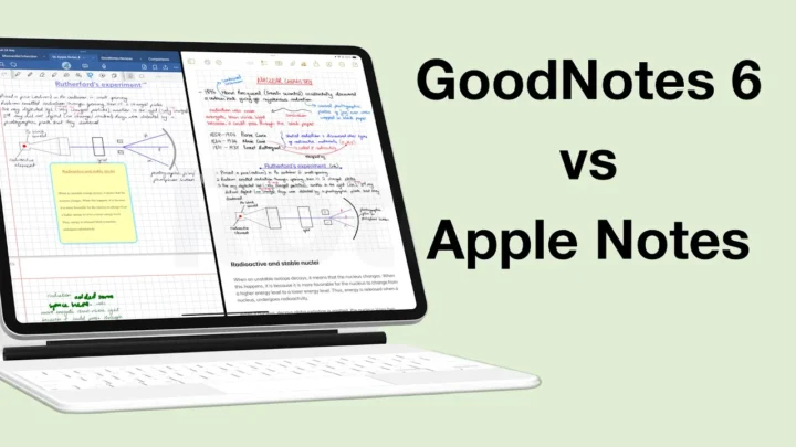
- Multiple instances can open the same notebook twice. Each instance can then have an in-app split view to open a total of four documents side-by-side. Notability also has vertical in-app split view, which puts documents above and below each other.
- True dark mode automatically switches the colours of everything on your page, and it works on PDFs (which is impressive).
- Scribble offers Instant Character Recognition (ICR), which converts handwriting to text in real time.
Notability 14 has improved page navigation in the app. We now have a bigger window for selecting multiple pages. Smaller thumbnails would fit more pages on the screen. Even better would be the ability to zoom in and out like we can in Noteful. Page rotation is still limited to PDFs, and even then, it won’t rotate anything on the page. For digital note-taking in 2023, that’s a massive pain, especially for an app as big as Notability.
You can select multiple pages to cut, copy, clear, duplicate, or delete them. Bookmarks are the only way to ease your navigation through massive notebooks, which is not enough. The app supports both vertical and horizontal scrolling.
Search tool
Notability can search all your notes in the app (handwritten, styled text, or scanned). It doesn’t display the number of results found, and in version 14, the search tool is at its worst. You can also search your notes from the app’s homepage. The results are no longer organised into title and content matches, which makes it difficult to find what you’re looking for with universal search.
Notability gallery
The gallery should be removed from the app. A social media platform in a productivity app is counterproductive. The fewer distractions a productivity app has, the better.
Organisation
Notability supports up to five levels of folders within folders for organising your notes in the app. You can lock your folders if you have sensitive information you need to keep safe. Like everything else, organisation is simple. You can auto backup your notes to a number of cloud services. Notability has a number of format options for your backup, and you can choose to exclude some folders.
PROS
- creates small documents
- supports GIFs
- exports PDFs with password protection
- locks folders
CONS
- subscription
- limited page rotation (no ink rotation)
- terrible user experience
Verdict
For settings, we recommend you check out our Notability user guide. Notability is no longer one of the best note-taking apps for the iPad for 2024. Though it packs a lot of unique and well-crafted features, using them simply takes too much effort for a digital workflow. It will slow you down, so you won’t be able to keep up with meetings or lectures because almost all the tools are difficult to use now. Thanks to the Notability 14 update, we now know that extreme minimalism can break a perfectly functional workflow. The app has also become annoyingly buggy, which is quite odd for Notability. How did the developers manage to ruin a once-perfect app?

