Unlike macOS Tahoe, iPadOS 26 still feels a bit buggy—especially the search bar, which just refuses to behave. I’ll probably regret installing this beta because I don’t have a backup. You’d think after all these years I’d have learnt, but no—I never back up my iPad before jumping into a new beta. I always get too excited and just go for it.
The bright side to all of this, is that iPadOS 26 is definitely smoother and more responsive than iPadOS 18. But there are still a few rough edges that need polishing. Let’s take a look at what’s exciting in iPadOS 26.
Glassy look
I was really excited to try that glassy, clear look with Liquid Glass. Unfortunately, iPadOS 26 doesn’t quite get us there yet. What we have instead is more of an automatic tint that is taking its colours from your wallpaper. Compare that to macOS Tahoe, where the glassy aesthetic really shines—it’s clean, transparent, and feels intentional. On the iPad, though, it still feels halfway there.
Even the Control Centre has this annoying background that covers part of your screen. If it were truly transparent, we’d still be able to see our apps and icons underneath. You do get a hint of that transparency effect in the App Library and on the dock, but it’s subtle—and not quite what I was hoping for.
User interface
The user interface across different apps looks great, though. Even the Apple Notes toolbar—which we weren’t fans of in macOS Tahoe—actually looks really nice in iPadOS 26. It’s less transparent than the one in macOS, so it’s not nearly as distracting.
The modern icons also look much better here, but we’ll dive deeper into Apple Notes in a separate article. Apple Reminders also looks fantastic, but sadly, there’s nothing new for Pages, Numbers, or Keynote. I was really looking forward to seeing how those apps would evolve, but it looks like we’ll have to wait a little longer.
We’ve got new icons for the Camera and Passwords apps, and the Keynote icon got a subtle polish too. It’s amazing how much of a difference a new background colour and slightly rounder icons can make—they give the whole interface a fresher, more modern, and minimalist feel.
The new glass sliders also look great. They’re not just pretty—they’re super responsive, too.
Folders
The colour-coded folders with emoji icons are great. But I wasn’t expecting the colours to be tied to tags. Tagging a folder and changing its icon colour really should be two separate things. I’d love to just pick a folder colour without having to tag it—is that too much to ask?
But, if you already use tags, you might actually like this setup. It’s kind of like killing two birds with one stone.
I really appreciate having folders on the dock—this will definitely improve our workflows. No more jumping into the Files app just to access documents on your iPad or in iCloud. I love this feature… The new Compress icon also looks way more intuitive than what we had in iPadOS 18.
One thing I wish they’d improve, though, is how folder colours are handled. They don’t show up on the sidebar, which is a shame. macOS Tahoe has the same limitation, and I was hoping the iPad would handle it better.
It’s a bit confusing seeing the same folder look one way on the dock and a completely different way on a sidebar. If we’re customising folders, that design should carry through everywhere the folder appears. What do you guys think—shouldn’t our customisation be consistent?
New apps
We’ll definitely cover each app in more detail later on, but for now, let’s just mention them. We’re really happy to see Preview and the Phone app finally coming to the iPad. Preview is much better for PDF reading and annotation than Markup and Books. So, we’re really excited to have it on the iPad.
It looks like both my iPad and MacBook are using a different account from my phone. Not really surprised—I do share the phone. But I thought we’d registered the new iPhone under my account. Apparently not. When it’s time to go through the Phone app, I’ll gather the strength to sort that out. Until then, I can’t test the app just yet.
The Journal app is easily the most exciting new addition in iPadOS 26. And now with Apple Pencil support—could this finally be the great journaling app we’ve been waiting for on the iPad? I can’t wait to try it! But that’s a whole other article. There are so many new apps to cover in iPadOS 26… Oh, and I almost forgot about the Games app. We already took a looked at it in macOS Tahoe, and it looks pretty much the same here on the iPad.
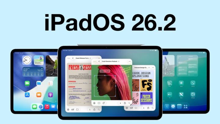
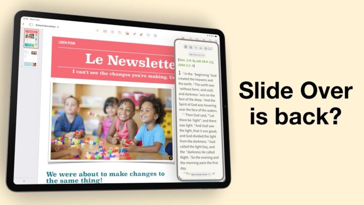
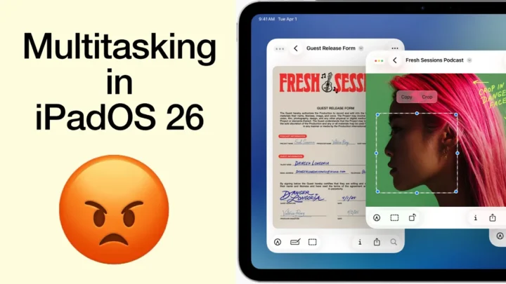
Multitasking
iPadOS 26 has taken multitasking on the iPad to a whole new level. Windowed apps are so much better than Stage Manager—we really should have had them sooner!
What I love most is how familiar they feel if you already use a Mac. You can resize and stack windows however you like, and in iPadOS 26, you can even tile them. The new menu bar is also a great addition—it makes everything feel more desktop-like in the best way.
That said, I’ve had a few moments where I accidentally activated a window I didn’t mean to. Palm rejection still needs a bit of work. But for a public beta, it’s actually running pretty well.
And folders on the dock? Super useful when multitasking. You can even choose how you view them—either in a fan or grid view, which gives you a bit of control depending on your workflow.
Background tasks make it so much easier to work with multiple apps without interrupting what you’re doing. We’ve needed this for years, especially when exporting videos. It’s such a relief not having to sit and wait for an export to finish—you can just keep working, which is definitely going to save a lot of time.
Of course, this will only really shine once more developers start building it into their apps. Some apps need it more than others, but it’s a big step in the right direction.
Final thoughts
Just like in macOS Tahoe, iPadOS 26 brings updates to Messages too—but honestly, those are better to explore on the iPhone… Now that we have proper windowed apps, maybe it’s time to say goodbye to Stage Manager altogether. What do you think?