The Intentional Living Planner, version 1.0, is a minimalist planner by our creative team at Paperless X. It comes in three versions: monthly, weekly, and daily planners that cost $9.99, $14.99, and $19.99, respectively. They are available for purchase on our Patreon page or on our website. These planners will work in any note-taking app or PDF reader that can open hyperlinks.
Cover page
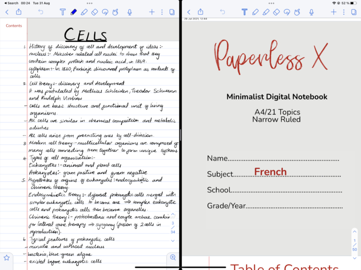
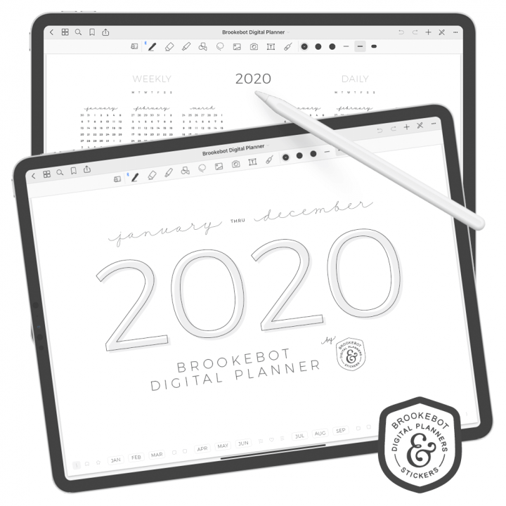
The cover page for all the planners looks the same. They kept the same look we have from our digital notebooks, but each has a summary for the planner on the bottom left corner. We currently have one version for the monthly and daily planners and two versions of the weekly planner.
Year of…
The “year of” page for each planner is different. The monthly planner has the simplest “year of” page. It lists all the months of the year and links to each of them. I think the underlining on the months doesn’t look good; perhaps they can remove that for the next version the planner. You also get a place to write down your goals for the year. One massive goal per month is achievable, right?
The weekly planner lists the weeks for the year and links to each of them. I love that it is undated, making it flexible and reusable. You only need to buy it once. Undated also removes the rigidity of getting a planner at the beginning of the year, or at the beginning of a specific season. Your first week could be from 5-11 February, and you can simply write that. Your second week can be a few weeks after that. Without the dates, the planner is much more flexible. Lastly, you can also write down your goals for the year.
The daily Intentional Living Planner is partially dated. Partially because it simply lists the days for each month and links to the daily spread for each month, but the dates are not specific for any year. It is also reusable, so you can write the dates on your daily spread. I love the “year of” page for the daily planner the most. It lists all the days of the entire year on a single grid. We’re used to seeing calendars, right? But this is different, and it works, especially if it’s a planner you want to buy once and use forever.
Unfortunately, this daily planner does not have a place for your yearly goals, like the other two planners. We look forward to seeing that in the next version of the planner. Instead, it has links to templates and the “year at a glance” page, which are available in all three planners. The templates help you track your finances, habits, and meals. You can also journal in the planners.
The most important part of the “year of” page, which is not labelled on the daily planner and is missing on the weekly planner, is the notes section. I don’t know how it’s important when it has so many inconsistencies. Anyway, the notes section is where the planner gets its name from: Intentional Living. The creative team is encouraging us to reflect and take note of everything happening in our planners. I have been encouraged to question myself to evaluate what I am planning, what I achieve, and what I don’t in these small notes and reflections sections. It’s a recurring feature throughout all the planners.
Instead of decorating; reflect.
– Paperless X creative team
Year at a glance
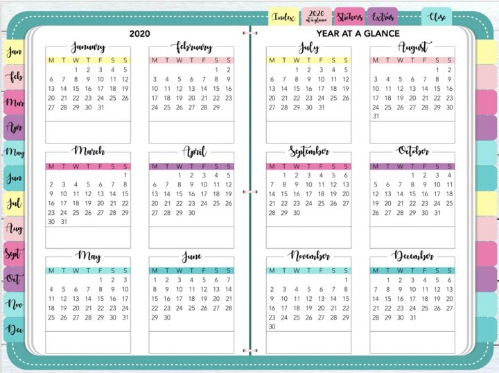
The “year at a glance” page is exactly the same on all the planners. It’s where you can note the biggest events and plans for each month of the year. There is a small box for the date, and then the item that you want to remember. What are the chances you will have more than seven big events in a single month? If you have more, then a minimalist planner is probably not for you.
The spreads
The monthly planner only has monthly spreads; the weekly planner only has weekly spreads; and the daily planner only has daily spreads. The planners don’t mix spreads at all.
Monthly planner
For the most minimalist of us, like me, who keep planning to a minimum, the monthly planner is great. The monthly spread lists the days of the month on the left side. Then your goals and to-dos for the month. At the bottom of the spread, you have a small table for meetings and events.
This is the planner I am using for work, and it’s perfect for me because I generally am not big on planning. So, I use the planner strictly for work. I don’t get the difference between goals and to-dos for the month, though. To me, they feel like the same thing. The appointments section is a bit small for a month, but you can use the dates and notes sections if you run out of space. Still, workarounds are not great.
My favourite part of the monthly spread is the notes section, naturally. As I try to live intentionally, inspired by the planner, I have found it strangely useful. It helps me track ideas that come to me on a whim and also reflect on both my successes and failures. It stings a bit when it’s a failure, but that’s growing pains, right?
Weekly planner
Goals and to-dos make more sense for the weekly planner. Not that I would use them differently; just more room to add tasks when planning weekly. The weekly planner has a bigger meeting/appointment slot. See why I think the monthly one is small? We have versions that start the week on Monday and Sunday. For each day, you can schedule three meetings or events. Four, if you also use the top row where your day is labelled. How many meetings can you possibly plan for a single day?
I love the “done” section, where you can tick off what you actually did. This will help you pay attention to how much you’re planning and what you actually end up doing. At the end of the week, take the time to reflect on it. If the space is not enough, you can duplicate the journal template. Reflecting on a week might need a few pages.
Daily planner
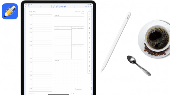
The daily planner has the hours of the day on the right in 24-hour notation. They are currently working on the 12-hour version; hopefully it’ll be ready soon. If you’re planning your day to the second, what are the chances you’ll need both goals and to-dos? It’s overkill. Maybe they could think of better uses for that space in the second version of the planner. For the daily appointments, the position of “done” bothers me a little. But when you zoom in, and this is where Noteful excels, there is a tiny gap between the line and the word. Still, that space can be bigger in the future, or am I being petty?
All the planners have one page linking to all the pages in the planner, that is, the “year of” page. Then, every page in the planner links back to that page. So, you could be planning for your day, but you need to check a date two weeks from now. You simply go to the “year of” page and look for the date you want. It is the simplest navigation we have seen in a digital planner. Do you like this simple navigation, or do you prefer something a little more complex?
Verdict
The Intentional Living Planner helps you focus on what matters. Be intentional about what you’re doing in 2024. The limited space for planning helps you narrow down what must go in your plans, and when you’re done, tick off what you’ve completed and reflect on how you achieved it. Be intentional with your finances, habits, and even what you eat. These planners are for those of us who dislike decorating planners or when you simply don’t have time to do it.


