The WWDC25 keynote introduced us to this year’s round of OS updates—their biggest change being how everything looks. As soon as I could, I signed up my Mac, iPhone, and iPad (in that order) for the developer betas. That’s how we’re going to cover them—starting with macOS Tahoe in this video.
New design
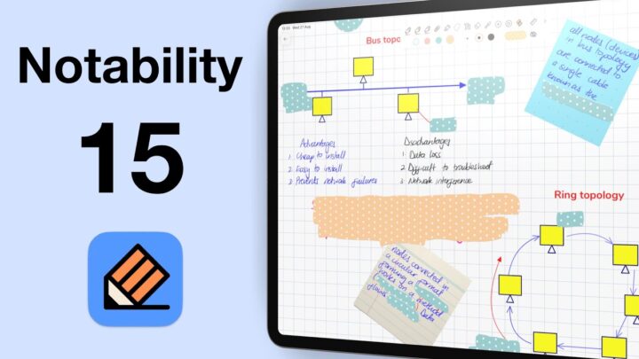
macOS 26 feels a lot like the kind of UI refresh we saw with Notability 14—rounder icons, and smoother buttons. Only our app windows have a subtle glassy feel and glossy finish that really catches the eye. I instantly loved it, especially in the Control Centre! And the new look in Settings is just fantastic. The menu bar? It’s absolutely beautiful.
However, the more apps I opened, the less I liked what I was seeing. Not all icons look great—some actually give off a weird double-vision effect. And the floating toolbar in Apple Notes? It’s a nightmare. Why did they get rid of the clear opaque separation we’ve always had? Seeing my notes behind the toolbar really strains my eyes. I find myself making a conscious effort not to look at it—which is frustrating, especially for an app I use pretty much all day. Am I the only one who finds these transparent floating toolbars horrible? The old Apple Notes toolbar was perfect. Interestingly, Finder isn’t affected by this—the implementation here is spot on.
The transparent menu bar is gorgeous. I love how seamlessly it blends with the desktop now. And if this look isn’t your thing, don’t worry—you can still switch back to the classic menu bar. When windows overlap it, the transparency can make things a bit hard to see, so that’s when the old style really comes in handy. Having options like this is always a win.
Dock
The default dock icons gave me a similar vibe to Apple Notes—the glossy look just isn’t working for me. Maybe it’s the dimmer colours or the finish. The QuickTime icon even causes a subtle double-vision effect, though Shortcuts looks fantastic. I ended up experimenting with other icon options, and they all looked better than the defaults. Dark icons stand out much more, and tinted ones can work too, but I couldn’t quite find the right tint. In the end, I settled on clear icons that look absolutely stunning on the desktop. Dark mode is gorgeous as well, and the transparent dock adds a nice touch—though it takes a while to really notice.
Launch pad
They’ve finally nailed the Launchpad! It was never really a problem before, but now it’s genuinely useful—we can access our apps without ever leaving the desktop. You can organise them however you like: by category or in alphabetical order. I still can’t decide which view I prefer—the list or thumbnails. I prefer opening this with a single click, though. Hopefully that’s how it’ll work in the final version, or at least give us the option. Right now, I keep forgetting I have to double-click.
User experience
Overall, macOS Tahoe is the most responsive operating system I’ve used to date. And for a beta, it’s seriously impressive. Everything feels smooth and effortless, which has us genuinely excited for the official launch. My Mac is running faster than before, and the performance boost is hard to miss.
Spotlight
Spotlight is easily the biggest and most useful update in macOS Tahoe. You can now focus your search on apps, files, and even Shortcuts. I’ve never relied much on Spotlight before, but in Tahoe, it’s quickly becoming my go-to for everything I’m working on. It makes everything feel instantly accessible—without ever needing to open a single app. And the integration with Shortcuts? Absolutely brilliant.
New apps
The Phone app looks so much better on a bigger screen. Honestly, we should’ve had it ages ago—but here we are. Centuries later, we finally have it… At least we didn’t have to wait that long for the Journal app—it’s only been, what, two years?
For game lovers, the new Games app looks like a lot of fun. If you know any good family-friendly games, please share them ideas —I’m in desperate need of some. For family and all. I’m not much of a gamer myself, so I have no idea where to begin.
Miscellaneous
Having transcribed audio recordings in the Phone app is fantastic, especially with the Apple Notes integration. I think we’re still waiting on the Markdown exports, though, because so far there isn’t any option to do it that we can see.
Messages finally catching up to WhatsApp isn’t exactly groundbreaking, so there’s nothing to get too excited about there. I mean, I suppose we’re a little grateful, but it’s hardly a game changer.
Final thoughts
We love macOS Tahoe because it’s simple, powerful, and definitely set to improve the way we work on the Mac. It’s not packed with dramatic changes, but every update we’ve seen so far feels intentional and well-executed. It is causing the Mac to overheat a bit, though—that’s something we’ll be keeping an eye on over the next few days.
