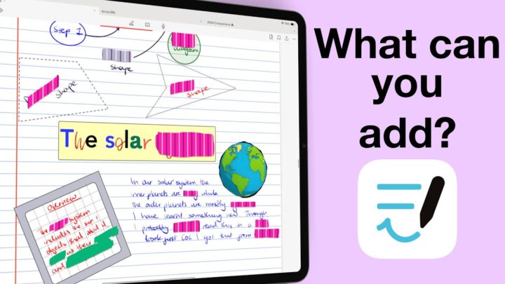
Freenotes is currently a free handwriting note-taking app by Hangzhou Free Note Technology Co., Ltd. It is available on the iPad and iPhone only. The M-series MacBooks can also use the app, though it is not verified for it. There are indications the app won’t remain free forever; we are just not sure when the developers will start charging and how much they will charge. This review focuses on the iPad version of Freenotes.
Creating new notes
Freenotes has a decent collection of page covers for your new notebooks. You can even change the colour of the simple ones in the app. There is no option not to have a cover, though. We look forward to having that because some of us actually don’t like notebook covers. Or is it just me? Page templates also have page and line colours. Unlike for your covers, you can use custom colours for page templates. For the basic page templates, you get line spacing options that range from one to ten. That is a decent range for line spacing. The app also has educational templates that are not nearly as fun to customise, but we’re still happy to have that many options.
Your page sizes for your new notebooks can also vary, and they can either be portrait or landscape. Freenotes has all the options you need to create functional notebooks in a handwriting note-taking app. But, of course, we have to use our digital notebooks. At first, we were excited about the app saving our complete digital notebooks to the app’s template library. That was until we opened the notebook and realised that it only saves single pages into the app. So we’re stuck with importing our digital notebooks whenever we want to use them. That is just tiring.
User Interface
The user interface takes some getting used to. Freenotes has two main toolbars, one fixed at the top and another floating one. It seems developers really like the floating toolbars, but they are annoying, especially when they overlap on our notebooks. A third pen-tool toolbar appears at the bottom of the screen, which you can remove if you don’t want to use. You can also move it to any side of the screen, so you might not need to turn it off, especially because it only appears when you’re using the pen tool.
We can’t get used to the tabs that are directly below the status bar. It feels like something is missing because we are used to having a toolbar in this section. The only other app we’ve seen with a similar setup is Noteful, but it doesn’t feel nearly as empty because it has a few icons before and after your tabs. The tabs are a lot smaller than they are in Freenotes. It’s difficult to pinpoint, but there’s something different about these two toolbars. Can you guys also see it?
Writing Tools
Freenotes has a fountain and ballpoint pen. Even with rounded tips and the minimum sensitivity, the fountain pen in the app looks different from its ballpoint pen. Both pen tools have thickness and opacity options, but the fountain pen has a wider range for your thickness. It starts at 0.10, all the way up to 30. When you configure it well, the fountain pen is great. The tip and sensitivity options really change how your pen looks. It can be a bit confusing trying to set up the pen though, because what you get when you do is not what you expect to happen. The ballpoint pen also has the dotted pen stroke option, effectively making it a dotted pen.
The thickness of the pencil tool ranges from 1 to 15, like the one for the ballpoint pen tool. It also has sensitivity and opacity options. A pencil tool with sensitivity options is quite impressive. The highlighter in Freenotes goes behind your ink. When you layer it, though, it will look like it’s going in front of your ink. For a split second. The opacity of your highlighter ranges from 10 to 50%, which makes sense. You can highlight freely or in straight lines. The app also has a dotted highlighter, which adjusts the dots after you’ve drawn them.
All your writing tools have three colours on the pen tool toolbar, which is insufficient for taking digital notes. Or do I use too much colour in my notes? The bright side is that you can at least decide what those three colours are. If you’re not happy with the default colours in the app, you can use custom ones. But still, three colours for each tool? They change depending on the tool you’re using. Your pen tool’s colours differ from those of your highlighter. The pen and pencil tools use the same colour palette, though. If the pen options are limited, you’ll appreciate the favourites toolbar that can house different writing tools. You can also add other tools that are not for writing. We got tired after adding twenty tools, and that’s probably enough to cover most note-taking needs. What do you think?
Handwriting Experience
The handwriting experience in Freenotes is good. Your handwriting looks like it does on paper, and palm rejection is perfect. However, it seems to take me a lot of effort to write, so I can’t write for long in the app. My hand starts getting sore. The only other app I feel like that in is Goodnotes 6. So, their handwriting engine is probably the same. Even with all that effort, my handwriting still does not look as good as it does in Noteful. I can write for days in Noteful and not complain about fatigue. If you’re using Freenotes, let us know if you’ve also experienced what I am talking about.
Eraser tool
The pixel eraser in Freenotes is smooth. The app also has a stroke eraser, which is my preferred eraser. It is fast and erases more with less effort. Which of the two erasers do you prefer? Stroke or pixel? Your eraser can be very tiny—you’ll struggle to see it—or massive (relatively speaking). It can erase the highlighter or tape only, and it supports auto-deselect. That is all features covered for the eraser tool.
Zoom Tool
You can zoom in directly on the page. We love that the app displays your zoom percentage on the screen and that you can lock your zoom level so it doesn’t change accidentally. You can zoom in up to 800%. Your pen tool uses vector ink, so it doesn’t pixelate when you zoom in. Your highlighter, too, but the pencil gets slightly blurry even at low zoom levels. Zooming out hits a minimum of 44%. That is a decent zooming range, but we have seen better in a handwriting note-taking app. Sadly, the app does not have a zoom tool. So, if you need that tool to handwrite your notes, you will not like Freenotes.
Adding Items To Your Notes
Text Boxes
Text goes inside text boxes in any colour you like. Text box borders would be greatly appreciated. Since we don’t have them, the text boxes don’t feel like text boxes. They are more like boring sticky notes. Freenotes supports many fonts, some of the most we have seen in a handwriting note-taking app. You can also use custom fonts in the app, so if you like fonts, Freenotes has you covered. You can search the fonts to work faster. There is obviously room on the keyboard toolbar to add more colours. But you only get one, which makes using colours for your text a little annoying. The app has alignment and line spacing options.
The four headings you get in Freenotes are just different font sizes for the same font. But it’s good that we can change that quickly. You can format your text to make it bold, italic, underlined, or strikeout. You can save your favourite text styles; we wish they were easy to reach. Favourite text styles should be readily available on the keyboard toolbar.
The app lets you add numbered, unnumbered, and checklists. The checkboxes (in this case, circles) are so tiny that it’s not surprising that they are not interactive. You can mistake them for bullet points. Your lists support levels, but your numbering and bullet points won’t change. The dashes for unnumbered lists are great for adding levels to your lists when you don’t have variating bullet types. Lastly, you can resize your text boxes and rotate them in Freenotes. The text options are great, but the text boxes need some work. Do we need that much customisation for text boxes in a handwriting note-taking app? Do you use a lot of text in your handwritten notes?
Shapes
The shape recognition technology in Freenotes is the worst we have seen in a handwriting note-taking app. You must draw your shapes perfectly for the app to transform them, which is too much work for digital notes. We’ve not been able to draw a perfect triangle in the app. Maybe it’s not even supported. Except for changing your border colour, there’s not much you can do with your shapes in Freenotes.
Photos
You can add multiple photos from the Photos library to your notes. The app supports PNG images, and we expect nothing less in 2024. Freenotes then lets you crop them as rectangles or freely. We love the freehand cropping tool; it is smooth and easy to use. You can resize and rotate your images; that is all you can do with your photos in the app. Photos are as unexciting as the shapes. You can also take photos with your iPad camera.
Tape
Freenotes has some cute tape for active recall; most of us will love it. Your tape can be one of five fixed sizes—a decent range, we’d say. The feature works as expected; you toggle it to reveal or cover your notes. The app also has an option to hide or reveal all the tape in your notebook. We appreciate that because it will save you a lot of time you’d waste tapping each tape to open and then close it. With this feature, you can open all your tape and close it all at once when you’ve finished studying in the app.
Timer and Stopwatch
The timer is a cool feature that makes active recall in the app even more fun. You can add a timer to count down the time during your study session. You can put it anywhere on the screen, but it remains horizontal no matter where you put it. Let us know if you have always wanted a timer or stopwatch in your handwriting note-taking app. We’ve never thought of it, but it has its place. We hope the developers can put it on the toolbar to make it easier to access, but other than that, we love it. You can easily repeat a countdown, refresh or delete it. The app alerts you when the timer has ended. Would you want it to ring when the time is up, or is the silent popup notification enough? Do tell.
Stickers
Stickers should be on the toolbar because there’s plenty of room for one more icon. Besides, its current location is just confusing. The stickers in the app are very cute, and Freenotes has a lot of free stickers that are easy to edit if you want to. You can rename your sticker collection, delete stickers you dislike, and even add new ones. But with the amount of work you need to get to the stickers, they are not fun to use! Do you think they are worth the hassle?
Audio Recording
Audio recording that does not sync to handwriting is useless in 2024. But at least you can still use the app while writing; it is much better than the setup in OneNote. However, we still look forward to having audio syncing. The playback options for your audio recording are decent. You can fast-forward or rewind ten seconds at a time. You can also speed up the playback and slow it down. Freenotes can merge your audio recordings if you have multiple in your notebook. You can trim your recordings to remove sections you don’t want at the start or end of the recordings. You can also rename them.
Lasso Tool
In Freenotes, you can pick up specific items on your page: handwriting, highlighters, text boxes, images, and tape. We will always appreciate a selective lasso tool. The lasso can be freehand or rectangular. Typically, rectangular lasso tools also have resizing and rotation capabilities, but they don’t in Freenotes. So, there’s probably no need to have both since they work exactly the same way. Which lasso tool do you prefer, freehand or boxed?
You can duplicate your selection, take a screenshot of it, or change the colour of your handwritten notes. Freenotes can also lock images and text boxes in your notes to make them uneditable. You can’t even pick them up with the lasso tool when locked. We love how easy it is to unlock locked items. This is a rare feature to find in handwriting note-taking apps. Lastly, you can save selections to your sticker collections. What’s a sticker feature if we can’t create our own stickers?
iPadOS Support
- Multitasking with multiple instances can open the same notebook twice. The app supports drag and drop into the app, but you can’t drag anything out of it. Let’s hope the developers can add that feature in the future. Freenotes can also open multiple tabs if you want to open more documents, which covers all the multitasking capabilities you need in a handwriting note-taking app.
- Scribble is the only handwriting conversion you get in Freenotes. Unfortunately, the app does not convert your handwriting to text.
- Freenotes supports true dark mode, which converts everything in your notes. It even works on PDFs, and images look good in dark mode. It’s definitely the best dark mode we have seen in a handwriting note-taking app. Have you guys seen anything better than this?
- You can add scans to your notes using the iPadOS scanning engine.
Page Editing
Notebooks in Freenotes can have different page templates. The app supports both vertical and horizontal scrolling. You can view the thumbnails and bookmarks of all the pages in your notebook. Selecting a couple of the pages allows you to rotate or delete them. That is not a lot of interaction with pages for a digital notebook. Freenotes can add new pages to your notebook. You can also duplicate existing ones. The app doesn’t let you copy any pages, though. So, if there is a page you want to copy and paste into a different notebook, you’ll have a hard time with that.
PDF Reading
Two features are important for PDF reading in a note-taking app: hyperlinks and outlines. Freenotes has a painful way of navigating hyperlinks. We are grateful to have them, but if we need two steps each time to move through the pages of a digital notebook or planner, then paper is better. No? Hyperlinks should respond with a single tap. So we hope the developers can work on that.
The app recognises outlines; you can edit them to add, remove, and rename items. We love that Freenotes can nest your outline; few handwriting note-taking apps support that. A nested outline—what more could you ask for? PDF annotation relies on the writing tools in the app, which are fairly easy to use.
Search Tool
The app does not search through your handwritten notes, only through the text in your PDFs. Most digital note-takers want to search through their handwritten notes. Otherwise, what’s the point of writing them in the first place? For text, however, the search tool is good. The app highlights the text found in your document, and you can filter the results to focus on bookmarks or outlines. The app also shows you all the pages where the term was found, but without a detailed preview of where the search term is, it is still difficult to find what you’re looking for. A setup similar to the outline results (if we can get more details) would be ideal. What do you guys think about the search tool in Freenotes?
You can share your notes in PDF, image, or native format, but the app does not have exporting options for PDFs and images. So, if sharing documents is a big part of your workflow, you might find Freenotes a bit limiting.
Syncing and Backup
The app syncs your notes via iCloud. The backup is local, though. Freenotes keeps a version history of your notes in the app, and we don’t feel like the best backup setting. What happens if something happens to the app and your backup is in the app? Just the thought of it makes me uncomfortable. But the version idea itself is a good one. We were happy to see it in the app, but it’s no longer that exciting after realising that it’s the only backup we have. We hope the developers can give us the option to back up to different cloud services and that we’ll get to keep the history version of our notes because that is actually quite cool.
Organisation
Freenotes organises your notebooks into folders, and the app supports folders within folders for up to five levels. We don’t recommend using more than three levels of organisation for digital notes, so five levels are definitely more than enough. We like that all the folders are on the sidebar because it makes navigation a lot easier, and you don’t have to dig into folders to find your notes. All your folders and their folders are easy to see on the side, making them very easy to get to. Another cool thing about the homepage in Freenotes is that you can toggle the sidebar. So that will give you a bit more space to work with.
Your notebooks can display as thumbnails or lists. You can organise them according to dates and names, but also manually. Where you can move them around and keep them fixed in certain positions. With a growing database, that can be a bit of work, but it can be handy if you have to pin some notebooks. Pinning itself would be ideal, but you’ve got to work with what you have, right?
PROS
- Free, for now
- Timer or stopwatch
CONS
- Terrible shapes tool
- Confusing UI
- Audio recording does not sync with handwriting
Verdict for Freenotes
Freenotes is pieced together from different note-taking apps, and it’s very easy to see. You can see Noteful, Notability, Goodnotes, and Apple Notes, almost as if the developers copied the codes from all those apps and pasted them to build Freenotes. Are we the only ones seeing that? Overall, it’s a decent app, especially because it is free. We can’t help but wonder how it will compare to our note-taking app. Let us know if you want to see that comparison. We hope the developers can move around some icons to have one central toolbar. The audio recording tool, stickers, and timer should all be on the main toolbar, along with all the other tools we use for taking handwritten notes in the app. What do you guys think about Freenotes? Is this an app you’re going to try?

