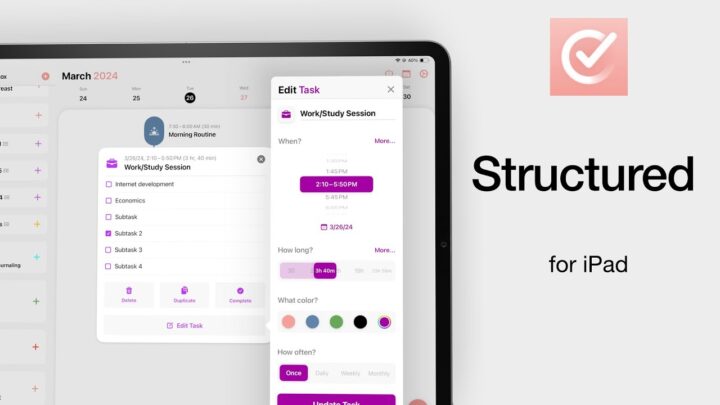
Fantastic human, hello! Today we’re looking at Tiimo, the planner that won the App Store’s iPhone App of the Year award. It is a minimalist planner that blends your schedules, tasks, focus sessions, reminders, and even mood tracking into one clean and gentle experience.
It works across iOS, iPadOS, macOS (M1 only), and even has a surprisingly capable web version. Pricing sits between $7 and $12 per month, or about $29 to $54 per year. Explanations for all the prices would help, but Apple doesn’t give us any. Tiimo has a full month free trial. So, you have enough time to really feel how it fits into your everyday life before you commit. I love when apps give you that kind of space.
Importing Reminders and Calendar Setup
Let’s begin with something Tiimo gets absolutely right: migration, especially if you’re coming from Apple Reminders. You can import your existing lists in just a few taps. It’s smooth and genuinely helpful, because it lets you see immediately how Tiimo approaches tasks differently.
Even though there isn’t a strict hierarchy inside the app for your imported to-dos, everything still links back to Apple Reminders. I like this because you can easily return to your tasks and see them in context with the rest of your work whenever you need to. A lot of people hesitate to switch planners because they don’t want to rebuild everything from scratch — this removes the biggest barrier.
You can also import events from Apple Calendar. Imports in the app work per device. So, for example, since I chose to focus on the iPad version of the app, I only imported events on this iPad, and kept the iPhone clean. I found this surprisingly useful. Sometimes one device just becomes your planning sanctuary, and Tiimo respects that instead of forcing everything to sync everywhere. If you want your imports on all your devices though, the initial setup can be a painful one.
Now let’s talk about design — because this is where Tiimo’s personality really comes alive. It is quietly minimalist. There are no heavy menus or long lists fighting for your attention. Instead, you get a gentle little menu at the bottom of the screen that you hardly notice. It could be the icons, their colour; maybe both. You forget it’s even there, and I mean that in the best way. This calm design makes the app incredibly easy to live with. You never feel overwhelmed, and that’s something I think more productivity tools should aim for.
How Tiimo Separates Tasks from Your Schedule
One of the smartest decisions Tiimo makes is separating your to-dos from your daily schedule. We don’t always plan tasks the moment we think of them. Sometimes you just want to write it down and deal with it later. Tiimo gives your mind space for that.
Then you have the timeline layout for your daily schedule — which is perfect for what you’re working on that day. I often switch between the compact and timeline layouts because they serve different moods and different kinds of days. Really can’t decide which one is better.
Subtasks are clear and easy to follow, and completed tasks look satisfying at the bottom with a clean strikeout. And you can show or hide them (the completed task) depending on whether you want a tidy space or a visual reminder of your progress. I do wish the font was bigger, though. There seems enough room for bigger text. Both on the iPhone and iPad.
Using the AI Assistant for Planning
Now let’s talk about one of Tiimo’s most memorable features: its AI assistant. Instead of typing, you can simply talk through your plans, almost like thinking out loud. The AI listens, understands, and even asks helpful follow-up questions that gently guide your thinking. If you’re working on a big project, the AI can break it down into subtasks for you. It feels like having a quiet planning partner who isn’t trying to boss you around.
Of course, if you enjoy manual planning, everything is still there — colours, emojis, photos for your task icon. I love them. You can make your tasks visual in a way that feels personal. I found myself using emojis to mark different workloads — a little colour does wonders for clarity. You also get start and end times for events.
Focus Sessions and Task Progress
Tiimo also links tasks directly to focus sessions, which gives the app an interesting twist. You can start a focus session tied to a specific task or just run a session on its own if you want to get into a groove. And I love that there’s no pressure to use the feature either. You can simply ignore it, but it’s gentle and encouraging. So why not! And if you want music, it’s there: Lofi, celestial, Tiimo, Acoustic. I mostly work without music, and that option’s there too… The countdown to your next task adds a soft nudge that keeps you moving without feeling hurried. Love that too!
Mood Tracking and Health Integration
Mood tracking is another thoughtful feature. You can log how you’re feeling for the day, and your mood data syncs with the Health app. It’s these little touches that make Tiimo feel more like a personal companion than just another planner app.
Profiles for Separating Different Parts of Your Life
Now, one of Tiimo’s truly standout features is Profiles. This is perfect if you want to separate different aspects of your life — say work, home, studies, hobbies. Everything can live in its own little world, though I think linking them would be difficult if they are so separate and disconnected.
But here’s where Profiles become brilliant: if you share your device with someone, each person can have their own planning space inside the same app. For many households, this is an incredibly practical feature. I haven’t seen many planner apps offer something this thoughtful.
Customisation Limits and App Responsiveness
Now let’s shift into what Tiimo doesn’t quite get right — because no app is perfect.
Theme customisation is limited but maybe that’s part of the app’s minimalism. On the iPhone, themes work well enough. But in iPadOS 26, they’re broken. We couldn’t change the colour in anyway. But for the iPhone where it works, it doesn’t seem to do much. The background doesn’t change; only the focus dial picks up the colour you choose. It’s not really a theme in the full sense.
And fonts? You only get two. Icons are the most customisable, which doesn’t make a lot of sense. I mean, there are better spaces that need personality more than the icon. So, if you love personalisation, this may feel restrictive.
Repeating tasks are limited too. You only get weekly and monthly cycles. If you have yearly reminders or daily habits, you’ll have to work around the limitations — and that can get frustrating.
Responsiveness is another issue, especially on the iPad. Sometimes you tap an icon a couple of times and nothing happens. Maybe this is why the iPhone version won the Apple Award, but the iPad version didn’t. The difference in smoothness is noticeable.
Tags also feel underdeveloped. You can add them while creating tasks, but there isn’t a dedicated tag page or filter tab where you can instantly access everything under a specific tag. Even the to-do list tabs you see inside the app don’t appear when you’re creating a new task. You just have to trust Tiimo to sort things automatically, and that isn’t always ideal. You can change where your task goes, and that for me is a huge drawback.
Why the Web Version Feels More Complete
Now let’s pause and talk about something that truly surprised me: The web version of Tiimo is actually the most powerful version of the app. When you log in, you get a full calendar — daily, three-day, weekly, and monthly views — along with a functional sidebar that’s more flexible than anything on the iPad or iPhone.
This is the moment Tiimo finally makes complete sense as a cross-platform tool. I don’t usually enjoy apps that force you to make an account, but here it genuinely adds value. If anything, the web version makes me excited for what the iPad version could become.
Overall Experience and Who Tiimo Is For
After using Tiimo across devices, here’s how I’d sum it up:
- It’s an exciting planner that feels gentle, spacious, and visually calm.
- It doesn’t try to overwhelm you with rigid structures. Instead, it gives you just enough guidance while letting your day breathe.
- Even with its flaws — the limited themes, the missing repeat cycles, the unresponsive iPad version — there’s something deeply refreshing about the way Tiimo handles your day.
You can use it alongside Apple Reminders or let it replace Reminders entirely. And because of features like Profiles, the AI planning assistant, focus sessions, and mood tracking, Tiimo quietly builds this balance between structure and creativity. It gives you structure by letting you schedule tasks, use timelines, link items to focus sessions, and keep your day organised. At the same time, it lets you plan in a looser, more creative way — you can speak your ideas out loud with the AI, use colours and emojis, drop tasks in without assigning times, and move between profiles depending on the part of your life you’re working on.
It supports planning when you want order, but it doesn’t force you into a rigid system when you just want to think freely. It’s a planner that feels alive, but never loud.
If you’ve tried Tiimo or you’re considering switching, I’d love to hear how you’re using it. Do you rely on Profiles? Do you talk to the AI assistant? Does the focus timer help you stay grounded? Share your thoughts below — your experience might help someone else decide.