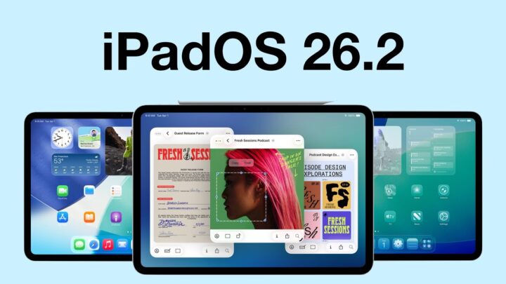
I was genuinely excited, practically buzzing, to get my hands on the new iPadOS 26. Apple promised us Mac-level multitasking, a dream for anyone who truly wants to push the iPad beyond content consumption. But after a couple of months now, with iPadOS 26, I’ve got to be brutally honest… they didn’t add a new feature, they fundamentally broke what made the iPad great. Today, I’m going to lay out exactly why I’ve come to despise multitasking on the iPad.
The Old Way Was Perfect
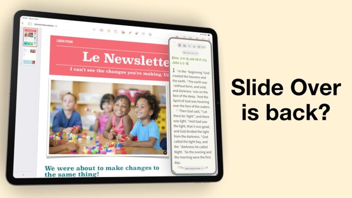
The old combo of split view plus slide over was the best touch-multitasking ever invented. You grabbed an app from the dock, hovered it at the edge, boom — two apps, equal partners. We could easily resize them, too. Need a third? Flick from the right, another app slides in like a polite waiter, then swipes away. It was fast, spatial, pure muscle-memory awesomeness. I could open any app, drag it off-screen, and recall it with a thumb swipe while holding a coffee. My mom could do it. My eight-year-old nephew could do it. iPadOS 26 killed all that delightful fluidity and hard-won muscle memory in the name of “windowing.”
Windowed Apps Mode Is Chaos
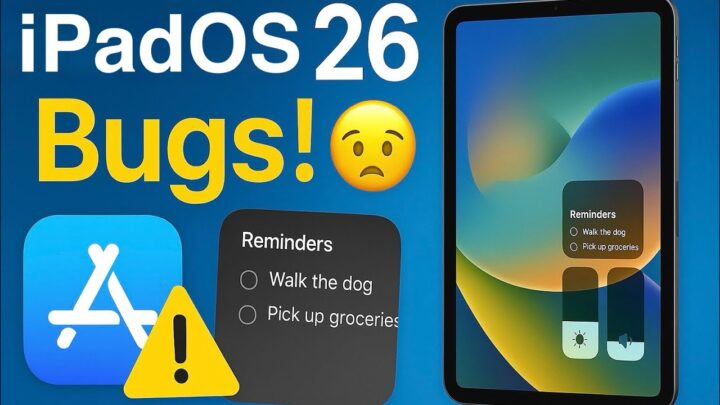
Now every app launches in a floating rectangle with a permanent resize knob. It’s too close to my plus icon in Apple Reminders. Once, maybe twice, I have accidentally resized when all I wanted was to create a new task. I’ve also brought up the dock trying to resize Messages. That never used to happen before. Anyone else experiencing these mishaps?
Want two apps side by side? You have to tap, long-press, then pick ‘Tile Left,’ then hunt for a second app. Opening a simple reference PDF while writing in Pages now takes seven taps; two of them long-presses. On the old OS it was two swift swipes. Multiply that by a hundred times a day, and you question your life choices.
Stage Manager Is Not Any Better
“But wait,” you say, “just use Stage Manager!” Nope. It’s the same core philosophy: little Mac-like windows bumping into each other. On an external monitor it almost makes sense, but on the 13-inch iPad screen it’s an absolute nightmare. With iPadOS 26, Apple basically said, ‘You will live in Stage Manager or you will live in windowed mode. Both options are terrible!
My Workflow Ruined
I work with tonnes of apps every day. We’re trying to evaluate and review apps, create courses, design efficient workflows, and writing up reports for developers. My daily rhythm was a finely tuned machine: Apple Notes pocket-sized in Slide Over for quick rough notes, Notewise (the app we’re currently studying) in full-screen, and Goodnotes splitting on the right for quick reference. Now? Apple Notes launches in a window that inevitably covers everything, forcing me to juggle z-layers like it’s 1998. For me, the old way wasn’t just convenient – it was mission-critical.
The Mac Does It Right
I don’t hate windowing; I hate windowing on a *touch tablet*. On my MacBook, three-finger flicking between full-screen spaces is muscle memory. The iPad has its own superpower: direct, intuitive touch manipulation. Apple fused those DNA strands and, I believe, created a hybrid that inherits the worst of both. The result? We get a half-backed desktop experience pretending it loves your finger. It’s like putting a sail on a motorcycle and calling it a yacht.
But There Are Good Bits
I’ll mention the positives so you don’t call me a hater. Background tasks finally lets Lumafusion continue exporting videos when I move away from the app. The new menu bar with top-level access to file operations is chef-kiss. Those are legit wins, and I’m grateful. Correct me if I’m wrong, but none of them required deleting Split View or Slide Over. Apple could have added a simple toggle: classic vs pro windowing. Or is the development a lot more complicated than we think?
What I Want Back
What do I want back? It’s simple. Give me Slide Over exactly as it was: a thin card, summoned by edge-swipe, dismissed just as easily. Give me Split View with the three-dot handle so I can swap apps in half a second. I would also kill Stage Manager, but some people like it, even the windowed apps. Until that happens, I’m carrying two devices again: my iPad for the apps we study, my MacBook for everything else. My backpack is heavier, and my enthusiasm for the iPad as a true productivity machine is dimmed.
If this rant sounds familiar, hit the thumbs-up so Apple sees the numbers. And drop your own multitasking nightmare in the comments—maybe Tim Cook’s intern is scrolling.
The Future
Could iPadOS 27 reverse course? History says maybe. If the backlash keeps growing, we could potentially see the return of multiple instances, and slide over at WWDC. Or even better, before that.
So yeah, I hate multitasking on the iPad now. Not because I fear change, but because the old way was faster, safer, and felt made for human hands. Apple traded simplicity for checkbox parity with the Mac and, in my humble opinion, it’s a disaster. Do you also dislike the new multitasking in iPadOS 26? If yes, then help us hype this video to get Apple’s attention. Leave a comment, smash that like, and share this with every iPad user you know. Maybe together we can nudge the world’s biggest company to fix our iPad workflows.
