Flexcil has a new version, they are calling it Flexcil 2. The logo has changed. Which one do you think is better? Flexcil 2 is impressing us before we even open it! At first glance, the user interface has improved. The icons are smaller and the lighter background colour looks good. They’ve moved towards a modern look and it’s pleasing to see.
Flexcil 2 is currently free, we are running their trial version and there’s some indication that we will have to pay for the standard version. That has always been their signature move. They release a new app and give it to you for a free trial before asking you to pay for the standard version. We’ve talked about subscriptions and most of us agree that paid updates like this one are not entirely unreasonable.
On the homepage, they’ve moved some icons around to more intuitive places. You’ve got your search bar on top of the sidebar. Your settings and mailing icons have moved to the left. You can now collapse this sidebar to create more space for your documents which you can now mark as favourites. Next to the Recents tab, they have added the Favourites tab. Lastly, on the homepage, they have changed the options for viewing your documents.
Open multiple tabs
We’ve been playing around with the app for a few days and have multiple tabs open. You can Hide Tab Bar if you want a minimalist look for your app.
Toolbar
Your toolbar looks neater and more minimalist because of the smaller icons. The handwriting experience hasn’t changed. It feels as good as it did in the first version. However, your pen customisation window now has an option to draw Straight line. You can now save straight line drawing pens to your toolbar. It is quite useful for PDF reading. Flexcil 2 now supports the draw and hold gesture that straightens outlines. Let’s hope they’ll be supporting all shapes soon.
Lasso tool missing
The lasso tool for selecting, moving and resizing your annotations is missing from the toolbar. Did they move it elsewhere? Or is it missing from the whole app entirely?
Vertical scrolling
They have added vertical scrolling both for your main documents and the popup document.
Open documents in a popup window
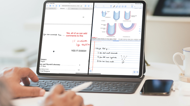
Before we could only open notes in the popup window but now we can open documents too! This is handy when comparing two documents. You can also open notes in the main app window now and that officially makes Flexcil 2 a functional note-taking app.
You can now open the same document twice within the app, even though the app supports multiple instances. Flexcil 2 also supports Scribble for iPadOS 14. You can add documents or notes to the popup window with drag & drop from the main window’s tabs. It would be nice if we could return them to the tabs the same way.
Gestures working and text formatting in the popup window
You can now select and capture objects from the pop-up window, something we couldn’t do in the first version of the app. For your text, you can now change fonts, their colour and size.
4-page view
Flexcil had a maximum of a 2-page view, Flexcil 2 has a 4-page view, which our developers claim is better for Powerpoints. Naturally, we were curious to test their theory and we are glad to report it is actually true. This feature introduces a new fascinating way to take notes from Powerpoint presentations. Before now, students had to create lecture slides for their PowerPoints, but that’s unnecessary now. You can capture sections from your presentation and take notes on them in Flexcil. The app keeps links of your extractions and you can track what your notes refer to.
Full-screen mode
You can hide your toolbars and tabs but keep your annotation tools in the semi full-screen mode of the app. In full-screen mode, your annotating tools disappear leaving you with one selected pen tool, highlighter and eraser. You can easily switch to the gestures.
Fewer paper colour options
How is less a good thing? Let’s hope they will keep adding to these. Since we can create decent notes in Flexcil 2 now, we look forward to having page size options.
Highlighter behind text
Your highlighter now goes behind your text, no more dimming your notes.
Long-press gesture in pen mode
In Flexcil if you long press on your document, the app will warn you that your Apple Pencil is working. In Flexcil 2, that is no longer a problem. You can capture documents, add text and images while taking notes.
Extended hyperlinking
Before you could only create hyperlinks between PDFs and notes but in flexcil 2 they have extended that. You can now create links between PDFs (PDF-PDF) and between notes.
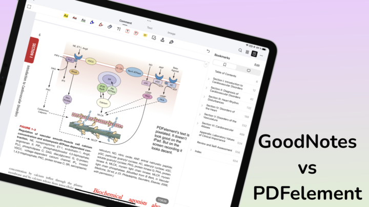
Our annotations are not working well in the new version of Flexcil. We are hoping that is something our developers can fix. This is an exciting update. Flexcil is certainly worth comparing to GoodNotes now.


