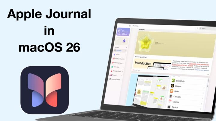
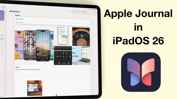
Apple Journal is a free journaling app that is only available on the iPhone and comes preinstalled with iOS 17. We have mixed feelings about its absence on any other device.
Update: with iPadOS 26 it is now available on the iPad and Mac.
User interface
The app can lock the journal once you’ve added some entries. It uses your iPhone passcode and supports FaceID, which makes it easy to lock your entries. But for more security, a different password would be better. It just makes it that much harder to access your journal. If you have no hidden secrets, you can choose not to lock your journal altogether. We appreciate their dedication to minimalism. Apple Journal is the simplest journaling app on the market, and it is too simple for what we were expecting Apple to release. We must admit that a simple journaling app is refreshing, but we can’t help but wonder how functional it is.
Creating a new entry
Creating a new journal is pretty easy. There is no way you’ll miss the massive plus icon for creating new entries. If you don’t know where to start, the app gives you some suggestions on things you can write about. Each has five ideas, and we are curious if these change over time. Or the app keeps suggesting the same things till you have written about them, and only then do you start getting new ideas. If you’re using Apple Journal as your journaling app, please let us know how the suggestions work. You can get suggestions from your Media, Contacts, Photos, and locations. However, if you don’t want any suggestions, you can simply turn them off. We love options.
You can then type your thoughts till your heart is content. We like the idea of a simple journal—something you take with you everywhere and jot down random ideas when they come to you. The app has some basic formatting options that require a bit of work to access. The app has practically no user interface; there is more than enough space to add the formatting options at the top to make them more accessible. There are times when you’d want to make something bold, right? For emphasis.
Adding items
We love that the app supports many different types of attachments that you can add to a single entry. Journal lets you add photos, videos, audio recordings, and bookmark locations. That is all the information you’d probably want to attach to a journal entry. Do you think they missed anything? However, clustering all the attachments at the top of the entry together makes for a terrible journal entry. It’s bad enough that we can’t interact much with our images, but we can’t even choose where they go. That was a massive dealbreaker for me.
When journaling and I talk about a tree I took a picture of, I would like to put it next to where I mention it. It is the most logical way to structure journals. Apple couldn’t even bring in the setup in Apple Notes, which blocks typed notes from images. It would have worked great in Journal, especially because the app is limited to the iPhone. The screen is small, so simply having images mixed with text would look great. Stickers could have made a decent workaround, but unfortunately, the app doesn’t support stickers. Only emojis.
At least tapping on the attachments immediately opens them, and we can scroll through all the attachments for that journal entry. That organisation makes it easy to find items that are related to each other. We were hoping it would work for the entries, too, but it’s been hit-and-miss. Sometimes, it opens the entry; at other times, it doesn’t, and it is unclear why.
iOS
Apple Journal supports dark mode, which is great if you want to journal under your blanket. We were expecting to have widgets for the app.
Organisation
The organisation in the app is simple and in chronological order, but there are no folders in the app. That’s probably something they are working on, right? Or do all the entries for a single year or month just automatically group together? We like that each entry has a date; a timestamp would be great to have as well. Who else likes to timestamp their journal entries? Especially when you write multiple entries in a single day, it helps to know when each was written. The filters are quite helpful when you want to focus on specific entries. You will love this feature when you have too many entries, especially because the app has no search tool. That’s unbelievable. Are we really supposed to scroll through all the entries to find what we want to go through? Or does Apple want us to journal and never look at the entries again? Do you ever go through your past journal entries?
PROS
- Simple
- Lock for the app
CONS
Only available on the iPhoneNo search toolAttachments are all fixed at the top- Doesn’t support stickers
No folders- No recycle bin
Verdict for Apple Journal
Apple Journal is simple, but it still needs some work as it’s missing some essentials to make the app more functional. Typing in your journal on the go makes sense, though it has more cons than pros. Handwriting in a journal is great, but typing also has its place. Since we’re used to texting, most of us will like Apple Journal, as it feels like texting yourself. What do you guys think about Apple Journal? Are you using it?


