My Digital Planner by Simply Digital Design
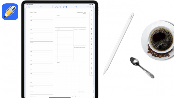
It is the cheapest and simplest planner on this list. This planner costs only $4 on Etsy. It’s undated; you only ever need to buy it once.
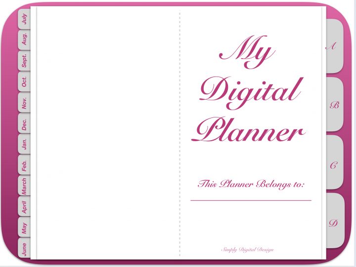
The planner has months on the left side. It starts from July to June, and each month is hyperlinked to a monthly spread. It doesn’t get more minimalist than this.
Don’t like spending too much time planning? This is the planner you want to go for.
On the right side of the planner are tabs. After the fourth and final one, there are templates for minimalist daily planning. Two daily templates, one weekly and an undated, unlabelled monthly template.
It also has a note page template, customisable to-do list page, what-you-plan-to-read & assignments-you-have-to-finish page template. Then get a few blank templates.
Academic Year Personal Edition by DigitalPlanner247
It costs about $28. This is my favourite planner. It took me back to my high school days because it looks like the old diaries I used at the time. I get nostalgic every time I look at this planner.
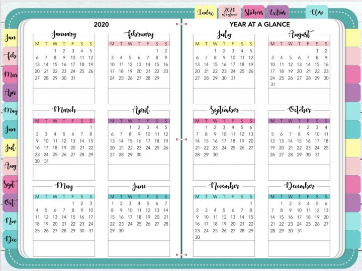
It’s probably the only planner you’ll need for a full personal planning experience. The first page comes with three calendars: last year, this year, and next year.
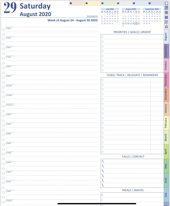
The top of the planner has 6 tabs (you can use these for anything you want). There are links to different pages on the right side: cover page, calendars, first month in the planner, notes, and templates. This planner has a lot of templates. It has templates for taking notes, business meetings, financial planning, personal development and health & fitness.
It has plenty of note templates to choose from, 17 to be exact. Each template links back to the cover page, calendars, the first month, notes and templates. This makes it very easy to navigate through the planner. The bottom of each template has hyperlinks to the 6 tabs at the top of the planner.
The rest of the paper templates (business meetings, financial planning, personal development, health & fitness) are equally sophisticated and diverse. They help you organise every aspect of your life.
This planner is dated, starting from August. Each month has a monthly spread. The bottom of each spread has calendars for the previous and next month.
Each date on the monthly spread is hyperlinked to a daily spread. The daily spread has a little section for urgent tasks and priorities. If you find yourself needing more space, then you are doing something wrong.
Find out what planner I am using for my 2019-2020 academic year.
There is a bigger section for reminders and tasks for the day. Then another section for phone numbers and people you need to call? I doubt you’ll need this one in 2019 unless you have a secretary, perhaps, to write down messages and people you need to call back. Otherwise, it is much simpler to just add a reminder on your phone instead of pulling out your planner and writing it down.
There is a section for planning meals and snacks. I hardly ever need to plan my meals, but apparently, some people do. It’s a thing!
The main part (of the daily spread) allows you to plan tasks for the day according to the time they’re meant to be done, like a schedule. The planners come with 12-hr and 24-hr notations, whichever you prefer.
Each day has 2 pages. The first one for planning (described in the previous paragraph). The second one is a note page. You can do whatever you want on it! I mostly use this for journaling.
Brookebot’s digital Planner
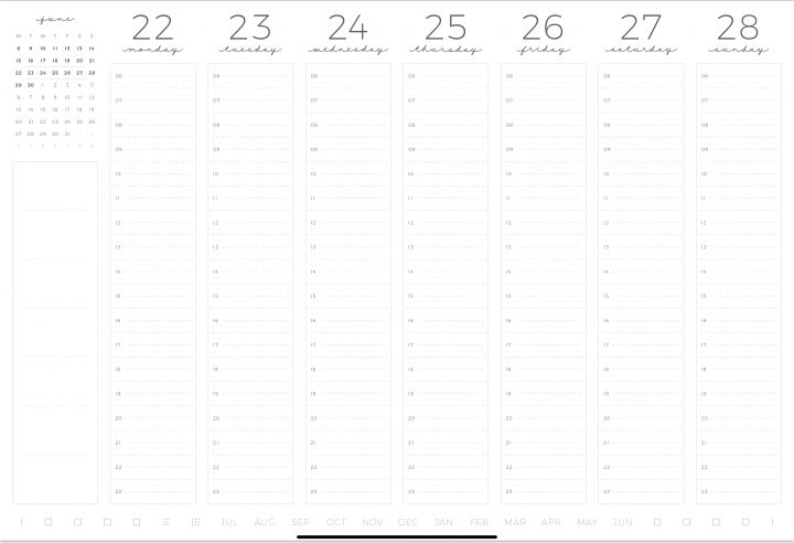
It’s very modern and classy. We have already established that today’s society is shallow. This planner is here to impress our shallow eyes! It is pleasing to look at with its minimalist modern design.
The bottom of every page in the planner has hyperlinks to tabs/dividers, the index page, months of the year and the 2019-2020 calendars.
The index page is for labelling dividers (to track what each is for). Most planners don’t have this. It’s very important to have an indexing system for a planner. The 2019-2020 calendars are hyperlinked to weekly spreads on the left and daily ones on the right.
The weekly spreads are minimalist, and your time stamps can either be 12-hr or 24-hr. You can schedule tasks according to the time you’re meant to do them, like in the previous planner.
The daily spread has a schedule, a section for tasks/to-do list and one for notes. This planner starts at $57. It is highly customisable when purchasing.
At the end of the planner are some templates for taking notes. Dotted pages, squared ones, lined and columned pages (has a margin in the middle of the page, separating the page into two columns).
The productivity box by Digitally Wild
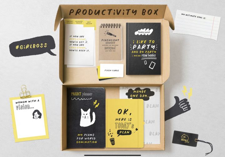
Do you love cute stationery? Consider this productivity box by Digitally Wild. For $39 you get 7 productivity tools! Not just a planner! I love the arrangement of items in the box. It feels like it’s on a desk. This is my second favourite planner on this list!
The first tool in the box tracks social media growth. It’s for content creators, I am assuming. It also had a habit tracker and a planner (for publishing content on social media platforms). There is also an empty template to customise as needed.
The next tool is a notepad. It has a realistic size, and is surrounded by cute sticky notes. It is just beautiful! The box’s texture looks real. Almost as if you can actually take it out of the screen and start using it physically. Naturally, if it were possible, I would not approve of such. It goes against everything this community believes.
The third productivity tool in the box is a reading journal. A very cute notebook to keep track of the books you’ve read and what you think about them. Each page in the journal links back to the main page of the journal, where all your titles are listed (an index page).
There are also flashcards. Each comes with a front part and a back one. They are cute, and I love them. I am just struggling with the idea of needing them in a planner though. Any suggestions on how I could use these flashcards? In a planner?
Another tool is the project planner. On the left, it has a mindmap, a year plan, checklist and month review. On the right, it has months to plan projects. It is undated. Every Monday date section hyperlinks to an undated weekly template.
The daily spread in the productivity box is also undated. It is designed for minimalist planning! It has a bullet journaling approach versus a planner approach. Very minimalist and straight to the point. There is also a notes section for each day.
I don’t spend hours planning or decorating my planner. So if you have a similar approach and you love anything oozing cuteness, consider getting this planner! It doesn’t get cuter than this folks! If you’re planning to transition from bullet journalling to planning, this planner might ease the transition for you.
The final tool in the productivity box is a planner for random ideas with undefined deadlines. Haven’t quite figured out how to use this one yet.
Typical planner with a 20% discount
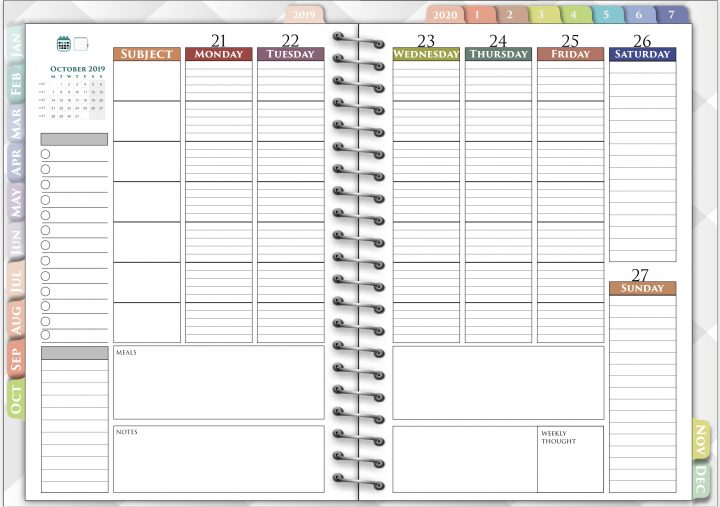
It has 2 calendars (2019 & 2020) and 7 tabs. Each tab has paper templates: lined, dotted, squared and plain paper. You’re bound to find something you like. This planner costs $15 on Etsy. This is a dated weekly planner. With a lot of hyperlinks. To see them all, check out their photos from their Etsy shop.
It is very basic, strictly for planning and note-taking only. On the weekly spread, you can plan your meals, take short notes, and evaluate your week. You can access your calendar and tabs from any page. It is very easy to navigate.
For a 20% off discount, use the code PAPERLESS20 in their Etsy shop.
Which planner do you like?
