For a good user experience, you need more than just how an app looks. Sure a modern-looking app is great, but more important than that is how intuitive it is. How everything is put together, and how easily you can switch between the different tools that you need. In some cases, it’s even a question of availability. Our team has examined 20 handwriting apps and come up with 8 apps that stand out for the best user interface and experience. We’ll start with the two worst and then spend more time on the best apps.
Nebo
All, except one, of the apps on our list are not as minimalist as we’d like them. They all have a separate homepage and workspace, and Nebo is no exception. The only difference is that Nebo has a lot of different work spaces for the different types of notes you can take in the app. But, the developers have kept the user interface consistent. No matter the mode you use. That, and the modern simple look in the app are the only points that Nebo scored in our test. It makes you wonder what other apps have, to out-perform such a beautiful-looking app.
OneNote
The other app scoring in the red zone (that means really low on our scale) is OneNote. Microsoft finally improved the look in the app. We have modern icons, less of the bold and old purple look. But it scores only two points more than Nebo because it is the only app on this list that has a single screen for the homepage and workspace. This is the best setup for a handwriting note-taking app. Your notes are at your fingertips and you can quickly switch between notebooks without losing track of what you’re working on. It’s brilliant because when you no longer need it, you can tuck it away just as easily. Sadly, though, nothing stands out after that.
None of the apps scored in the green zone for user interface. But three apps came close: Freenotes, Noteful, and Notes+. For second place we have Notability. And in third place, we have another tie, scoring only 9 out of a potential 17 points: Goodnotes and ZoomNotes.
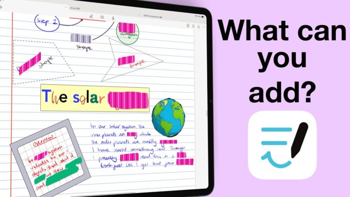
6. Goodnotes
We love that Goodnotes has fixed toolbars anchored to the edge of the app, and that the toolbar is very customisable. It’s sort of becoming a standard for handwriting note-taking apps, really. A customisable toolbar is not to be under estimated. It allows users to personalise their experiences, and all the handwriting apps on this list get that. Only have the tools you actually use and hide everything else.
How refreshing! However, the mobility of your toolbar isn’t that great in Goodnotes. It can only go to the top or bottom. For someone who prefers my toolbars on the side, if I can; that of course lost the app some points. Also the fact that it doesn’t have full screen mode or theme colours for your user interface.
5. ZoomNotes
If only the developers could work on the old icons, maybe even just removing the circle around them. That wouldn’t be a bad place to start. It took me a long time to edit this image [to remove the circles around icon]. It looks a lot better!
Once you get over that hurdle, ZoomNotes has some of the best user interface customisation you can get in a handwriting note-taking app. Probably too much, actually. It’s just losing a lot of points because of its looks. You can customise the size of your icons, in ZoomNotes, in addition to customising your toolbars. No other app on this list gives you that option. So, if you prefer large icons, small ones? It’s an easy fix in ZoomNotes. The app has 2 toolbars; the top one can only move to the bottom. That’s the other place you can put it. Then the one (on side) can go pretty much anywhere you like.
You can also custom your app colours and even the background for your notebooks. It has the most robust colour control for your user interface. It is also the only app on this list to have full screen mode. It takes several steps to get it, but it’s much better than not having it at all. Which is the case with all the other apps on this list.
4. Notability
Notability comes in at number four, as the only app scoring 10 points for your user experience. Unlike other apps on this list, Notability has a bit of everything but with limitations. Though we don’t have a separate homepage, we can at least view our notebooks without leaving the app’s workspace. It’s a bit difficult to appreciate because I only have four notebooks in the app. But when you have hundreds, this is a game-changer.
We are not huge fans of the floating toolbar, but at least you can put it anywhere you like. It is also fully customisable, so you can put only the tools you use often.
The theme colours in Notability are not as customisable as the ones in ZoomNotes, but they are more functional. From the workspace, nothing dramatic changes, but you will love them on the homepage. Not only are they easier to use, they are also much prettier than then ones in ZoomNotes. That is why it is ranking higher.
3. Noteful
Noteful is one of the three apps that scored 11 points out of the potential 17 we had for the user experience in handwriting note-taking apps. It has a separate homepage, and no way to access our notebooks without going back to it. You get no theme colours, but two colour options for the toolbar; dark and light. It’s not enough to get points for the app, especially because the light toolbar is difficult to see. It doesn’t support full screen mode but your toolbar is mobile. You can put it anywhere you want.
Unique to Noteful, though, is the ability to move your tabs independently. They are not stuck to your toolbar like is the case with most apps on this list. Your toolbar is also fully customisable, which has become a standard for handwriting apps in 2025.
2. Notes+
Like Notability, Notes+ has a bit of everything. A notebook library that is accessible from within the workspace, some theme colours for the user interface, and a partially customisable toolbar. It can personalise your pens only, though. But what made the app rank higher is that your toolbar can either be fixed/anchored to the app edge or you can let it float. While we don’t like floating toolbars, it’s better when we have the option to choose. That way users that do like floating toolbars can use it, and those who don’t can stick with edge-anchored ones. Were it not for the massive icons that we can’t resize, perhaps Notes+ would have ranked the highest on our list.
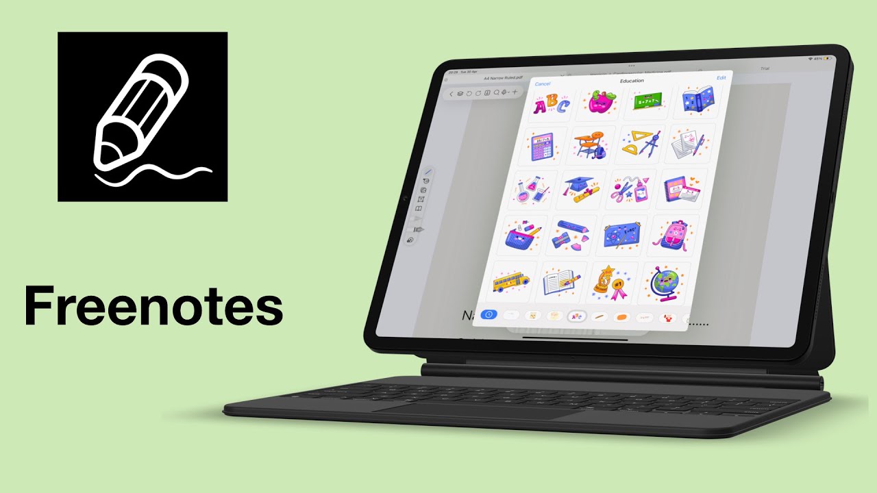
1. Freenotes
Freenotes has the most modern user interface, where its floating toolbars blend well with the background and pages, unlike all the other apps on this list. You can access your notebooks from within the workspace. Your user interface colours are more fun, allowing you to change even the colour of the app icon on your iPad home screen. Your handwriting toolbar can go on any side of the screen, but it’s only partially customisable. The top toolbar does not move to anywhere, but it is fully customisable. All the tools you hide remain easily accessible when you need them and that is a plus. However, the app doesn’t support full-screen mode.
Do you agree with our pick? Which app has the best user experience in your opinion?

