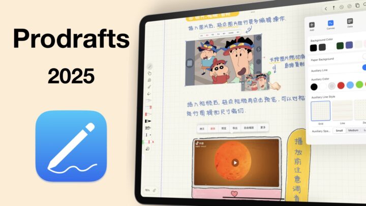
Kilonotes is a handwriting note-taking app by Hefei-T-Stack Information Technology Co., Ltd. It’s available for all your Apple devices (iPhone, iPad, Mac, and even Vision Pro), and it’s also on Android. It costs $6.99, a one-time purchase, but it also has some in-app purchases that are subscriptions. I am not sure how those would work. While I was still in the App Store, I thought it best to just update all my apps while I was still at it.
There is also a subscription for the AI member, which I am happy is a separate purchase. It will cost you another $5.99/month, but it’s optional. So if you’re like me, you simply won’t bother with it. This review focuses on the iPad version of Kilonotes, that I got for a one-time purchase. If you’re on the subscription and you notice some differences, please let me know in the comments. With the number of apps I try, I definitely can’t afford to subscribe to all of them.
New Notebooks
Kilonotes has a lot of book covers and page templates for new notebooks that can either be portrait or landscape. Basic templates even have a few colour options, but without knowing my page size, I thought to try my luck with our digital notebooks. I like knowing my page sizes. At the 150% zoom, it felt like a decent A4 page. For those using Kilonotes, have you got used to not having page size options?
An option to turn off the page cover would be nice. With so many cute page templates, I struggled to find simple, minimalist onees. That is one thing that I particularly find off-putting with Kilonotes. Its templates are just too colourful, ridiculously cute, and for me, it makes it difficult to take the app seriously. It reminds me of Collanote to some extent. I thought it was great that we can import templates into the app. But that’s only limited to images, not very impressive in 2024. I then stuck with the lined paper that has no line-spacing options.
As I thought, I actually didn’t like the ruled paper template. Though it feels like a narrow ruled template at the 100% zoom level, it’s still not exciting. Kilonotes has no page size or line-spacing options for your notebooks. If you use digital notebooks or planners, you’re stuck importing them every time you want to use them in the app. That is just unpleasant.
User Interface
Kilonotes’ user interface is much better than its page templates, refreshingly so. It is minimalist, with small, modern icons. It’s beautiful. I love that the toolbar is customisable. At its minimalist, you have one tool in the middle toolbar, and a few ones on the sides. The tools are still very easily accessible even after you’ve removed them, and you also have the option to completely turn them off. A customisable toolbar has become a standard for handwriting note-taking apps in 2024. I love that the toolbar is anchored to the edge of your screen. It won’t be floating over any of your notes. The toolbar is not mobile, though. So, you can only have it at the top there and nowhere else. It is a shame; I prefer my toolbar on the side, but it’s not a massive dealbreaker. Overall, this is a good-looking app.
Pen Tools
Kilonotes has four pen tools with five favourite colour options on the toolbar. Five is decent; more would be great. You can pick your pen colours using the grid, slider, hex code, or even the colour picker. That is all the options covered for your colour customisation options. I’ll always find three pen thicknesses on the toolbar limiting. Who’s with me? Your pen thickness has a thickness ranging from 0.1 to 4.0mm.
The gel pen is really just a ballpoint pen. I really wish developers could come up with a universal naming system. It would really make life easier for users. The fountain pen feels like a refined gel pen, with tapered ends but not enough thick variation to make for a fountain pen. It does feel much better than the gel and is quite usable. You can make the ends more rounded or sharper, depending on your preferences. The app has more settings to play around with the minimum width, pressure sensitivity, width, and motion smoothness. After playing around with these settings for a while, I did manage to get a tool that works for me. The differences are not very easy to notice, though. I am even doubting that they changed anything.
I applied the same settings to try what the developers call the pen, in the app. Unlike the fountain pen, this one has a pressure sensitivity option that is obvious to see. And it looks great— just the kind of fountain pen you’d expect to find in a handwriting note-taking app on the iPad in 2024. So, it looks like my favourite pen type in Kilonotes is not a fountain pen but just a pen. Technically, though, it is a fountain pen. It has all the characteristics. Perhaps the developers should consider renaming the current fountain pen. It’s more of a gel pen than a fountain one. The gel pen is actually a ballpoint, and their pen is a fountain pen.
The calligraphy pen has even more options, but none of them, no matter what you do, actually give you the calligraphy look. Kilonotes has the most confusing pen tool set I have ever seen in a handwriting note-taking app. This tool feels more like a brush pen, but even that is confusing because the last three pen tools look the same. All things considered, you can find a pen tool that works for you in the app. You might get frustrated while trying them out the first time, but once you decide on one, it should be easier. Kilonotes does not have a pencil tool, though. Let’s hope the developers can give us the tool in the future. If you’re using Kilonotes, what pen type did you settle for?
Highlighter
The highlighter tool has a similar setup like that for your pen tool. I like the default colours that are on the toolbar. They’re perfect, and that is rare to find. You have three thicknesses, and the range is exactly the same as that of the pen tool. That is odd. Because usually, the highlighter is much thicker than a pen tool. So both the thickest and thinnest are not ideal. The thin one is unusable, but the thickest is not thick enough. At least it goes behind your ink, and layering it doesn’t dim your notes. Kilonotes is especially buggy; stuff be malfunctioning randomly. The highlighter can be straight if you want it to be neat.
The handwriting experience in Kilonotes is amazing. It really has one of the best handwriting feels you can get on the iPad, and that’s really exciting to see. Palm rejection is perfect, and your handwriting looks exactly how it looks on paper. What more can you ask for?
Eraser
Kilonotes has the worst eraser execution we have seen in a handwriting note-taking app. When you’re using it, it feels like a highlighter. It is selective for the highlighter, which is good, but the pixel erase isn’t great. It’s not very smooth. It also erases per stroke and it supports auto-deselection. You have three thicknesses on the toolbar that you can’t change. I really dislike the eraser tool in Kilonotes. What do you guys think about the eraser tool in the app?
Zoom Tool
Kilonotes displays your zoom percentage when you zoom in on your notes. We appreciate that any day. You can zoom in up to 1500%, but zoom out only to 80%. It is a wide range, certainly one of the best we have seen on the market. I love that you can lock your zoom percentage, but the app forgets it if you close it. You will have to remember it for every notebook, it seems. That is not ideal, and we hope that in the future we will have an option to save the zoom levels we prefer. It would make it easier since we have to do this every time.
The zoom window also has an impressive range. It supports auto-advance, which works great when you’re moving on the same line. It is terrible when jumping between lines. You’ll be forced to move the window manually, almost every single time. That part is annoying. But it does have a margin, not sure if that would make anything better seeing how terrible it is at going to the next line. Pen tools would be nice to have on the zoom toolbar, so we look forward to having that in the future.
Adding Items to Your Notes
Shapes
In Kilonotes, you can draw your shapes and watch them transform. They remain editable after you’ve drawn them, but it’s a bit of a process. We should be able to just tap our shapes and edit them, without any extra steps. You can add and remove fill colour, and your shape border and fill can be different colours. Resizing and rotation also have that same long process to get to them, which can get tiring if you work with a lot of shapes. Even changing the colour of your shapes, especially when you want a different fill.
The shapes tool adds some unique lines, curves, and shapes. It just drops them on the page and you have to adjust them. These shapes are a lot easier to select if you want to edit them. But, they are also a limited variety and not as flexible as the shapes you draw yourself. The border and fill colour are a lot easier to adjust. But the app doesn’t have a border thickness option for any shape you add to notes; drawn or added. For filled shapes, you can barely see the border on your shapes, which is not helpful because the fill colour has no opacity options.
You can stretch, shrink, and rotate the shapes. These shapes somewhat feel like images, sometimes. Overall, the shapes tool has all the features you need, they are just not well packaged because something that takes you a single step to do in Apple Notes will take you two or three in Kilonotes. If this happened once I wouldn’t make a fuss, but every time you interact with each shape is a bit much.
The ruler tool looks too basic. I think it measures in centimetres; we’re left to guess that because I couldn’t find anywhere in the settings to confirm this. It works like any other ruler tool, but the more I encounter these digital rulers, the more I appreciate physical ones. Maybe because those are the ones I’m used to, but I’ll probably just grab a plastic ruler, put it on my iPad screen, and try to measure something. And hope that I don’t change the zoom percentage while doing that.
Text Boxes
You can add text boxes to your notes in Kilonotes. They are easy to resize, adjust, and even rotate. Text boxes just make your handwritten notes fun. You even have template text boxes that you can use. The app has a few of them. Adding a background colour, border colour, and thickness, adjusting your text box corners, adding a shadow, and some padding: you have yourself some decent text boxes. All these options are the exact ones we have in Goodnotes. You also get alignment, character spacing, and line-spacing options. The line-spacing is not very wide, but it’s quite impressive for a handwriting note-taking app. Character spacing is new for a handwriting note-taking app, and I am always thrilled when I discover new features; no matter how small.
You have a decent font collection, and Kilonotes supports custom fonts. Those are always fun to play around with. You get font size ranging from 1 to 200. I am assuming those are points. You also have some preset sizes for your paragraphs and headings. You’ve got to love Kilonotes, right? Like with pretty much every tool in the app, you have five favourite colours for your text. It makes it easy to change the colour of all your text in a single step. The fewer the steps, the better. It’s definitely better than what we have for the shapes tool.
You can format to make your text bold, underline, and struck out. After all this effort, you definitely want to save this, and Kilonotes supports that. The app lets you save as many templates as you need. It’s funny that the developers have this for the text tool but not for the pen tool. I mean, for a handwriting note-taking app, a favourites toolbar for your writing tools is probably more important than one for text boxes. Just saying, but that’s not to say I don’t like the templates in the app. If you’ve ever wanted to save your text box styles in Goodnotes, Kilonotes has you covered. It’s probably not a feature you’ll leave Goodnotes for, though.
Text Extraction
Even more impressive is Kilonotes’ ability to extract information into your text boxes. It’s just that I don’t have a lot of notebooks in the app, but you can extract information from any notebook in the app. I love text extraction, though the OCR for this one is not very good. I thought it would work better with text, but it didn’t. It’s still a work in progress, but it’s a very interesting tool to have. For someone who hates using text boxes, this could actually change that. So let’s hope the developers can perfect it. Do any of your guys use this feature? Maybe it works better in a different language.
Hyperlinks
Kilonotes can create hyperlinks to any notebook in the app. The links are very easy to create and navigate. How fantastic is that?! Not many handwriting note-taking apps can create hyperlinks, and this is such a game-changing feature for any digital note-taker. Even if it is limited to text only, and to all the text in the text box. We do hope we’ll be able to link to selected text in the future. But, we’ll take whatever we have in the meantime. You can also add web links to your notes. Hyperlinks are awesome any day!
Photos
You can add photos to your notes. I love that your images are easy to select, move around, resize, and rotate. I hope we get this for the shapes tool. You can also stretch and shrink your images. Cropping was difficult on this blue image; it was better on a white background. You also have a rectangle crop, and the app has an opacity option for your images. Kilonotes can do a lot with your images; flip them, crop in different shapes that look like frames, and remove backgrounds. I don’t like that the app saves these as stickers of sorts. All I want is to add them to my notes, not keep a copy of them, which I am inclined to delete. It just feels like such a waste. The app should maybe ask if I want to save it as a sticker but automatically add it to my notes. Kilonotes has a lot of features you don’t get in many handwriting note-taking apps for your images. But, I can’t say that they are life-changing. They are probably fun for scrapbooking, but I wouldn’t use them for any serious note-taking. I am probably just a boring human being. You can lock your images to avoid them moving around accidentally, and unlocking is pretty simple.
Tape
There are three ways to use tape in a handwriting note-taking app: straight, freehand, and rectangular. Kilonotes had to just use my least favourite of the three. It just feels like too much work, with too little flexibility than the other two options. The app gives you five styles for your tape, and you can’t change them, which feels a little like stepping back in the past. But tape is tape, I mean, how creative can you get? It works like you’d expect from tape, with an option to open or close all of them. You can also choose to open all of the tape for a specific style, which is new and handy if you style- or colour-code your tape. Tape is simple and functional in Kilonotes.
Doodle Pen
The app also has a doodle pen, with cute patterns. They are great for digital planning, for those of us who like decorating. You can even adjust the brush, to make them as small as 2mm, to as big as 29.9mm. That’s an odd number, and the size we were expecting for the highlighter tool. But no, they put it for the doodle pen. I shall not comment. If you’re into decorating your digital planners, what do you think about these goodies in Kilonotes?
Stickers
If the doodle pen is not enough, you can also use stickers that you have to download first; one sticker pack at a time. Only the ones you need, of course, because they are a lot. I wish the sidebar was big, to make them easier to navigate. I appreciate the anatomy stickers. Just had to acknowledge them for a sec. Stickers are really just images. They have the exact same options, which makes sense that the app creates custom stickers from your photos. You also get paper textures that I am still trying to figure out how I would use them. If you’re using these, please help me out here.
Audio Recording
Audio recording has become a standard for handwriting note-taking apps. It’s really unacceptable to not have the tool in 2024. The first thing to check is whether or not it syncs to your handwritten notes. In Kilonotes, it does not, and the audio playback is not great. It has zero noise reduction, so the audio quality itself is terrible because it picks up all the environmental sounds. Even distant ones that you’d naturally miss.
You can adjust the playback speed, up to 3x, which is faster than what you get in most apps. You can also rewind and fast-forward 10 seconds at a time. The app allows you to mark sections of your timeline to name them, which can be helpful and certainly something we haven’t seen anywhere else. I was going to say this is the worst audio recording feature I have seen in 2024, because it doesn’t sync, but the timeline marker can be an acceptable compromise. What do you guys think? It is extra work, but it’s probably better than nothing. For me, though, it wouldn’t work. I have never liked the idea of adding a play icon into my notes. Kilonotes even lets you resize and all. Let me know how you feel about the audio recording feature in the app.
Lasso Tool
The lasso tool in Kilonotes is selective of your handwriting, photos, text boxes, doodle pen, highlighter, and shapes. I thought it wouldn’t pick up the Cartesian planes and the shape because they didn’t dim out. It can either be freehand or a rectangle. You can resize your selection, rotate it, and take screenshots of it that you can drag and drop into other apps. While on drag and drop, you can also bring items into Kilonotes, which completes the feature. You can move your selection around the page, but you can’t move it across the pages in the same notebook. That is always an annoying limitation, but a lot of users are not bothered by that because there are always some decent workarounds for it.
Kilonotes also lets you translate your handwriting, which would be great if the OCR was good. Unfortunately, it is not. The app doesn’t have handwriting conversion, but you can change the colour of your ink.
Cards
Cards in Kilonotes feel like incomplete flashcards with a concept borrowed, in part, from MarginNote. After naming your card, picking a colour for it from four options, and adding some content to it… it just stops making sense. The cards don’t have a front and back, only a front, I guess. The next thing, you can select them for deletion. Tapping a card only gives you the option to delete or edit it. You can also see the source, where you created it from. In the app’s workspace, you can create cards from your notes by simply selecting a section, choosing a colour, and tagging it. This is giving Marginnote. It even looks like it. It’s definitely a work in progress. Nothing to be excited about yet, but we’ll keep an eye on the space.
Search Tool
Handwriting search is a hit-and-miss. But the app did manage to search through my terrible handwriting. So, it’s safe to assume that the app does search through your handwriting. The app can also search through your cards and other notebooks in the app. I love that universal search is integrated into the search tool, and that it’s not only accessible on the homepage. You can even search things on Google without leaving the app. We are always happy to see that, but I thought Apple banned this or something. At least according to the Notability developers, which is why they removed a similar feature from their app a couple of years ago. Are the Kilonotes developers breaching protocol? The previews for your found terms are quite decent. Finding what you need won’t be hard at all.
iPadOS Support
Kilonotes does not support dark mode, not even the false one. Your user interface does not change, neither do your pages, unless you have chosen dark page colour for that notebook. In 2024, that’s disappointing to see because iPadOS has supported this feature for years now. At least it supports multiple instances, and you can open the same notebook twice. Even have some windows in slide over. Do you guys also get that annoying iCloud popup? It’s driving me nuts! Kilonote has no in-app multitasking though, you can only open one notebook at a time. There are no tabs, or in-app split view. It works in stage manager, but data detection doesn’t. You can scribble inside your text boxes, but we don’t have any widgets for the app. iPadOS support is not great in Kilonotes.
Page Editing
Navigating hyperlinks is a two-step process when you’re using your pen tool. When you’re not, it’s much faster. You can view all the pages in your notebook. I love how easy it is to add pages with your current template. Kilonotes even managed to keep the hyperlinks active on new pages, so you shouldn’t have any trouble with our digital notebooks in the app. You can also add different templates, so a single notebook can have different page templates.
Multiple page selection doesn’t have a lot of offers, unfortunately. You can only delete or copy the selected pages. Kilonotes can enlarge your pages, which slightly distorts the our digital notebook template. I like that the crop portion has a template as well. So, it can also be squared, lined, and dotted. The extra space is great for adding more notes if you run out of space on your page. The only problem is that you can only do this for all the pages in your notebook. You can’t choose which pages you apply this to. That control would make this feature more complete. Adding space is not the same as changing the page size. Kilonotes is the second app we have encountered that does this. The same way you can enlarge, you can also crop the pages.
You can also choose the colour for the crop portion of your page, but without some opacity for the colours, they don’t work well for page colours. Kilonotes does not support page rotation, which is a must-have in 2024. You can also view your cards and filter which ones you see by tag or colour. The sidebar is resizable for your cards, not sure why it is not so for your notebook pages.
Kilonotes can export your notes as PDF, JPEG, or Kilonotes zip file. It automatically selects all your pages, which is great if you want to export all of them. I just wanted to export only those with notes on them, so deselecting them was a bit unpleasant. For a document with only 8 pages, I felt 33 MB is a bit big. The handwriting exported was good, but the text boxes are terrible. Despite supporting adding hyperlinks, the app can’t even export active ones. That was a disappointing surprise. Kilonotes differentiates sharing and exporting; they are pretty much the same. Why are they two different functions?
Organisation
Creating outlines is a bit different, but also feels incomplete. The heading labels don’t follow a natural hierarchy. They just feel like they are just floating in mid-air. If an outline doesn’t support nesting, it shouldn’t present the outline with levels. What is the point of that? It’s just confusing. This is the worst outline we have seen in a handwriting note-taking app. You don’t even have a bookmarking feature.
Organisation in Kilonotes is terrible. The app supports folders-within folders for at least three levels. But it has an interesting reverse folder system to the one we’re used to seeing in a handwriting note-taking app. You’re supposed to create a new notebook first, then create the folder. I like how the folders look; it’s different: beautiful, actually.
You can merge documents in the app. Merging is always a handy tool, so I am happy to see it. The sidebar gives you a better way to navigate your folders in the app. You can display your documents by type, date, and label. We don’t have lists, though. They are a decent option to have.
Auto backup is limited to Baidu, no Google Drive, Dropbox, etc. We should be able to at least back up to one common cloud storage. Manual backup is painful, it is the only option we have, unless you have a Baidu account or are willing to create one. It is not the most the best setup for a digital workflow. Your backup is not even usable, because it is not properly labelled. This is a massive drawback, because Kilonotes doesn’t seem to have both syncing and auto backup. Anything happens to the app, you’re losing everything.
There is no syncing option because each time I open the app, it takes me to the App settings for this, but there is nothing here related to iCloud syncing or accounts. What am I missing? And I have had a terrible experience with iCloud, so much that I want nothing to do with this app. Let me know if you’re able to sync across your devices. I currently have an issue with my account that I am trying to resolve with Apple for a previous purchase. So, I can’t download the Mac version to test that.
PROS
- Great text boxes
CONS
- No favourites toolbar
- Terrible audio recording tool
- Buggy
- No page rotation
- Cloud backup to Baidu only
- No iCloud sync
Verdict
Kilonotes has a different approach to a lot of things that makes it a unique app. But without any reliable auto backup or syncing system, I feel it will just be a waste of time putting important notes into the app. Users shouldn’t be forced to create accounts for Baidu just to use the app. The developers should look into giving us more options for auto backup. I am hesitant to recommend Kilonotes for any serious note-taking, but it is a fun app to explore.

