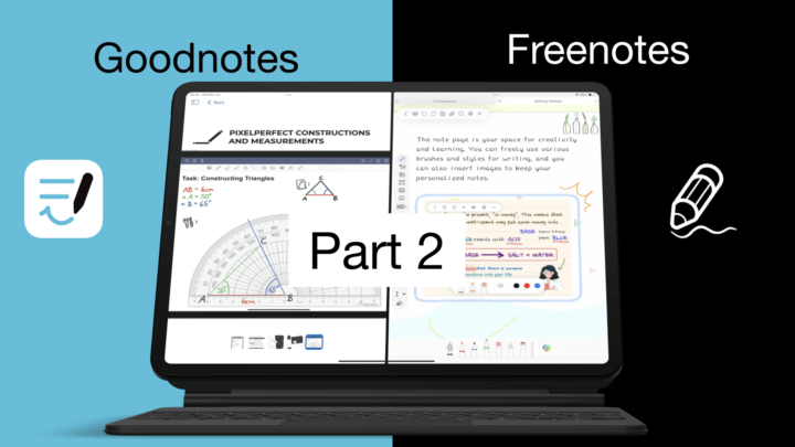
Freenotes is a great app, so naturally, we must compare it to Goodnotes – the most popular and the second most expensive handwriting note-taking app for the iPad.
Price and Supported OS
Freenotes, as the name suggests, is free. The app is available in the Apple ecosystem, mostly on the iPad and iPhone. On the Mac, only the iPad version of the app is available for the M-series Macs. That can be limiting if you’re using an Intel Mac.
For a one-time purchase of $30, you get Goodnotes on all your Apple Devices: iPhone, iPad, Mac, and even Vision Pro. But if you want to use the app on Android and Windows, you only have the subscription option of $10/yr. Not many iPad apps are available on Android and Windows, but we haven’t tried Goodnotes on other platforms to know how good the app actually is. So, if you’re using the app on Android and Windows, let us know how the experience compares to the iPad version of the app.
New Notes
Of the two apps, Freenotes has fewer page templates. You only get some basics and education templates. Goodnotes isn’t any better with its basic templates, a few planner pages, and music sheets. Both apps have a marketplace for getting more templates. They are easier to access in Goodnotes, but they are not free. All the templates in Freenotes are free, so you won’t mind looking for them.
Freenotes has basic page sizes; it has the same A-scale you get in Goodnotes. But, in addition to those, Goodnotes has an option to create custom page sizes measured in points. The maximum of which can get up to 5000 pt, which is more than 1m long. So, that is impressive, and so far unique to Goodnotes. You won’t get any line spacing options in the app, though, because Goodnotes doesn’t have those. Only Freenotes does, ranging from 1 to 10.
Both apps have orientation for your pages. They can either be portrait or landscape. You also get page colours, and they are centralised in Freenotes. So changing them once updates them for all the page templates in the app. But in Goodnotes, that is only available for the three default colours. Your custom colours are not centralised, so they are available for each template. It’s a lot of work to set it up and even using them once you’ve created them. Both apps also let you choose the line colour for your templates. Custom templates are limited to single pages in both apps. That you can add as PDFs or images to the app’s template library. Lastly, your notebook can have a cover, and in both apps, you can adjust their colours (with some limitations). Freenotes has cuter covers, though. They are definitely more appealing than the options you get in Goodnotes.
You will have to import digital notebooks and planners to use them in either app, which is definitely not ideal. Goodnotes has a slight edge with its custom templates, but it’s a feature I’ve never used in any app because I mostly just use our digital notebooks. You will get the exact same experience when creating notebooks in either app. Let us know if custom page templates are a deciding factor for you.
User Interface
Neither app looks minimalist. Freenotes has three toolbars, though the third one disappears when you’re not using the pen tool. Goodnotes’ tabs and the two toolbars never looked good from day one. But we’re used to them now. Of the two, Freenotes looks better, with the white toolbars. It looks more modern, even with the floating toolbars. One of them is mobile, but the bottom toolbar looks anchored there for some reason. Maybe it’s because of the split view. Let’s see if we can change it. Yes, it was the split view, and now it’s mobile.
The toolbar in Goodnotes is not as flexible, giving you just two locations for it (top or bottom). Both apps don’t enter full-screen mode, so this is as minimalist as they get. It’s not an amazing setup. There’s no clear winner for this; both apps have user interfaces that rank the same on our scale.
Pen Tool
Freenotes has two pens: a fountain and ballpoint. Goodnotes also has those, and it also has a brush pen that you don’t get in Freenotes. I don’t like that the pen thickness in Freenotes varies with your page zoom level. It is not the most ideal setup to have in a handwriting note-taking app. At least the app has a very wide thickness range that allows for that. It makes the one in Goodnotes look less impressive, but it’s actually quite functional.
The fountain pen in Goodnotes doubles as a calligraphy pen. So, if you like using different kinds of pens, Goodnotes has four types where Freenotes has three. The third pen tool in Freenotes is actually a version for the fountain pen; a similar setup we have with the calligraphy in Goodnotes. Only in Freenotes it is a gel pen. Depending on how you set it up, it can turn out to be a gel pen.
I am very happy that Goodnotes added more colours to the main toolbar. They are easier to access and that is always a good thing. Freenotes only has three colours on the toolbar, but none when in split view, as you can see. It doesn’t help that the app has a lot of colour palettes, and that you can even import and create new ones from scratch. At the end of the day, the toolbar can only carry three colours at a time. So all its colour features are a bit pointless.
Goodnotes gives you three thicknesses for your pen tool, but Freenotes doesn’t give you any. Instead, you can add favourite pen tools to the main toolbar. That is a decent workaround. Freenotes has an opacity option for your pen tool. Goodnotes cancels that with the dashed pen stroke, where Freenotes only has a dotted one. This makes another feature where the two apps score exactly the same.
Pencil Tool
Both apps have pencils, which is awesome! The pencil tool in Freenotes has a pressure sensitivity option, which we’ve never seen for a pencil tool before. It’s darker with zero sensitivity and lighter at the highest level. So, not too exciting but still something.
Highlighter
The highlighter in Freenotes goes behind your ink, even at 100% it doesn’t dim your notes. Though at first it looks like it does. The app has the option to change how prominent your highlighter is, but only one option gives an obvious difference. In Goodnotes, your highlighter goes behind your ink; it is much simpler with no opacity option. Both apps have a straight highlighter, and Freenotes even has a dotted one. It takes a second to register, but hasn’t failed yet. For a highlighter tool, though, the thickness in Freenotes is not thick enough.
Eraser
Like the highlighter, the precision eraser takes a millisecond to register in Freenote. But it is very smooth, like the one in Goodnotes. Both apps have a stroke eraser and are selective for the highlighter.
Favourites Toolbar
Goodnotes does not have a favourites toolbar. But the one in Freenotes is available on the main toolbar for your most used pens, pencils, highlighters, erasers, etc. A favourites toolbar is a must-have in a handwriting note-taking app. It makes it easier to switch tools when taking notes. Goodnotes, especially, should have this because the app has too many steps to do almost everything.
Auto-refine
Freenotes also has an experimental feature for refining your handwriting. This is the first time I have tried it since the developers added this feature to the app because it’s an experimental feature. I don’t want to get my hopes high. It’s available in English only at the moment, but it works. It did refine the handwriting with a decent level of accuracy. What do you guys think about it? Goodnotes does not have this feature.
Zoom Tool
Freenotes does not have a zoom tool, but you can zoom your page directly. You get a zoom percentage display on the screen, and you can lock your zoom level once you’re happy with it. The app’s zoom range is also decent. Goodnotes has a smaller range, does not display the percentage zoom, or lock it. But it does have a zoom tool that supports auto-advance.
Final thoughts
So far, Freenotes has performed exactly the same as Goodnotes, if not better in some instances. That makes you question if you should even be purchasing a handwriting note-taking app, doesn’t it? It’s still too early to know for sure because there’s still plenty to go through. Which app are you leaning towards so far? Let us know.
