Apple Journal is finally on the Mac — free, private, and beautifully minimalist, just as you’d expect from Apple. But once you start using it, it becomes clear this isn’t quite the Mac experience we were hoping for. It feels more like an iPhone app that’s been stretched to fill a bigger screen.
What Works Well
Let’s talk about what Apple Journal on macOS does well first — because there are some things to like.
It’s completely free and fully integrated into your Apple ecosystem. Everything syncs seamlessly with your iPhone and iPad, so your journal entries are always on any device you pick up. You can secure the app with a lock, which is great for privacy, and you can create multiple journals for different parts of your life — maybe one for personal reflections, another for gratitude, and one for Bible study notes. That alone gives the app a nice sense of order.
The Typing Experience
Typing on the Mac is actually the highlight. With a full keyboard, shortcuts make the experience smoother and faster — especially if, like me, you don’t always use a keyboard on your iPad. If your journaling habit revolves around typing, not sketching, this is the version that makes the most sense.
You can add multimedia too — photos, videos, and even voice recordings. Every journaling app should at least do that, and Apple Journal gets it right. It’s quick and clean, and there’s no clutter on screen.
Layout issues
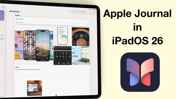
But here’s where things start to go downhill. Once you move beyond the basics, Apple Journal on macOS starts to feel unfinished. The layout isn’t optimised for large displays. The thumbnails that look neat on an iPhone feel oversized and awkward on a 13-inch screen — and that only gets worse on bigger displays. It’s clear this version hasn’t been redesigned with the Mac in mind. It just looks like an amplified iPhone interface.
There’s no text-formatting menu at the top, which feels like such a missed opportunity. There’s plenty of room for a proper toolbar, yet we’re stuck using a small popup menu. Sure, keyboard shortcuts can help, but it’s not exactly convenient. The app could easily take advantage of macOS’s screen real estate and power, but it doesn’t.
The bugs
Now, about drag and drop — it actually works… sort of. When I first tried it, the first image went in beautifully. The second one? Nothing. But the third attempt worked again. So, it’s definitely there, but it feels a bit unreliable. It’s the kind of feature that makes you pause and wonder if you did something wrong, even when you didn’t. If it works for you, you’re lucky — because right now, it seems to have a mind of its own.
And then there’s the double-click shortcut to edit text, which doesn’t work at all. It’s such a simple macOS gesture, but it’s ignored here. You can tell this is still very much the iPhone version, just living on a Mac — and that can get frustrating fast. Unless this is another bug that I am having to deal with. It hasn’t worked once, though.
And surprisingly, text wrap falls into that same “sometimes” category. At first, photos just sat awkwardly at the top of our entries, like they used to when the app was first released. Then, out of nowhere — while filming — it started working. The text wrapped neatly around the image as if the app suddenly remembered what it was supposed to do. I’d love to believe it’s fixed, but given how unpredictable it’s been, I’m not counting on it just yet.
Boring UI
Then there’s the missing personality. There’s no way to customise how your journals and their entries are displayed, no colour themes — nothing. It’ not just a macOS issue — it’s an Apple Journal thing. I was hoping the power and flexibility of macOS couldn’t unlock something special — maybe a little more freedom or personality — but it didn’t. Even on a bigger screen, Journal still feels too restrained, as if it’s afraid to let you make it your own.
Limitations
And of course, there are missing features. There’s still no mood logging on macOS — that’s only available on iPhone and iPad. You can technically add drawings, but using a trackpad to hand-draw your thoughts feels impractical. It’s not the kind of experience anyone’s going to enjoy for long.
All of this leaves Apple Journal on the Mac feeling incomplete. It’s not a standalone journaling app; it depends on your other Apple devices. You’ll need your iPhone or iPad to log moods, your iPad if you want to handwrite, and your Mac if you prefer typing. It’s as if Apple expects you to juggle between all three just to get the full experience.
Conclusion
If you only plan to type your entries, Apple Journal on macOS can still be useful. It’s clean, quiet, and distraction-free — and that can be exactly what you want for reflective writing. But if you expect a proper Mac app, with the power and flexibility that macOS allows, this version falls short.
I can’t help but wish Apple had gone further. A proper toolbar for text formatting. Custom themes and layouts. Even small things like letting us rearrange entries on the homepage would go a long way. There’s so much potential here, but it feels like Apple’s holding back. Apple Journal on macOS could be an amazing app. It just needs to embrace what makes the Mac special — not borrow everything from the iPhone.
So for now, if you want a simple, secure space to write, this version works. But if you’re looking for something deeper — something that feels truly Mac-native — you might be left wishing for more. Apple Journal for macOS is a solid start, but it’s still very much a work in progress.