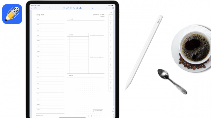
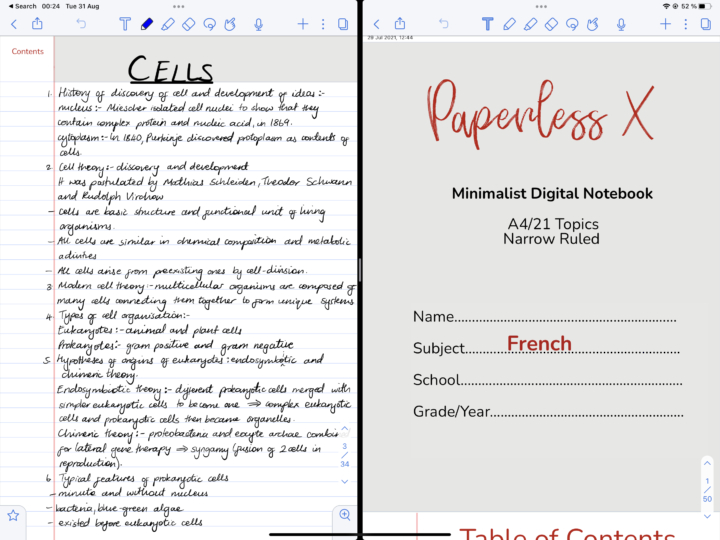
Noteshelf is perfect if you’re not big on buying planners every year and you want all your plans in one place. That is because Noteshelf has by far the most page templates we have seen in any note-taking app. It has a wide variety of note-taking paper templates and productivity templates for finance, health & fitness, household, travel and holiday templates. To get started with your journal or planner, you will need the Noteshelf app, of course, an iPad and an active stylus (Apple Pencil). After years of trying different planners, we have finally designed our own minimalist planner.
In the app, go to the plus icon and tap New Notebook. Tap on the paper template to pick a template. Under Digital Diaries, select the diary or journal you want. Pick a Start and End Date for your planner. Each planner’s period can’t exceed 12 months. Choose the orientation of your diary at the top of the screen (portrait or landscape). Underneath that, on the left corner of the screen, you can choose a paper template size depending on your iPad or iPhone size, or you can pick a standard paper size and tap Done. Pick a cover for your planner, and under Options, you can turn on Auto-backup, Evernote Publish or Set Password. Name your new planner and Create Notebook.
The hyperlinks in the planners
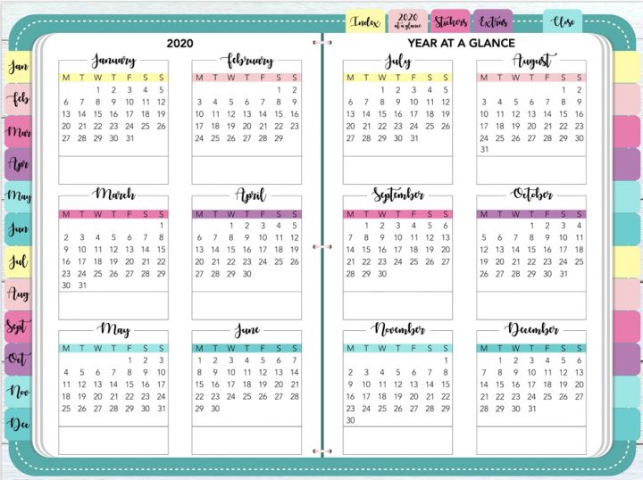
Noteshelf has two planner types: Modern and Classic. Both have similar hyperlinks for all the months on the first page of the planner that link to their respective months. All the dates on the monthly spread link to daily spreads, and the year goes back to the yearly spread. On the daily spread, the month links back to the monthly spread, the day of the week takes you to a weekly spread, and the year under the quote on the right side of the planner takes you back to the yearly spread. When you’re on the weekly spread, the day of the week takes you to the daily spread, the month to the monthly spread, and the year will take you back to the yearly spread.
All these hyperlinks are intuitive, and Noteshelf has improved its hyperlinking for its planners this year. We’ve had a few problems with hyperlinks in the past, so this is a refreshing improvement. Whether you use your fingers or the Apple Pencil, the hyperlinks are very responsive.
Classic planner vs modern planner
This year’s modern planner is minimalist in all its spreads. The quotes linked to each date just make the planner more useful. The classic planner has a more familiar look than the modern one; it’s typical. Here is how it differs from the modern. It has no space to write anything on your yearly spread. The modern one has the option to do that, even if it is in a small space. It almost looks like it’s designed to allow for some writing. The classic planner has a section for taking notes on your monthly and weekly spreads. The modern one has enough space to allow for that if you like using stickers.
You can’t write anything on your monthly spreads because there’s no space to do that on the classic planner since your dates are not in grids. Your daily spreads don’t have inspiration quotations on the classic planner. The weekly layout is different from the modern one. It comes down to what you prefer, though. The modern planner certainly has plenty of space for decorating and using stickers. But if you prefer taking notes, maybe it’s best to go with the classic planner.
Verdict
Noteshelf has great planners this year. If you already have Noteshelf, these are free. If you don’t have Noteshelf, that will cost you $9.99 for the planner, which you won’t have to upgrade every year.
